Welcome to Day One of the Island Batik's November 2021 Blog Hop - Storm at Sea.

The November Challenge for Island Batik required that we make a Storm at Sea quilt, lap size or larger, using the Summer 2021 Fabric bundle. I received the collection Bellingham Bay - designed by Deb Tucker’s Studio 180 Design.
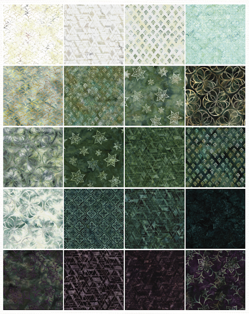 |
| Bellingham Bay |
Those of you who know me know that these are not my favorite colors. I find them dark and depressing. Guess this was an added dimension to the challenge.
I turned to EQ8 to mock-up the color combinations to come up with a suitable design. After a few iterations, I chose this one and tried to replicate it.

 |
| Practice Blocks |
 |
| Choosing Fabrics |
 |
| Choosing Fabrics |
 |
| Work in Progress |
 |
| Coming together |
 |
| Almost there |
 |
| Hobbs Batting - Cotton Wool Blend |
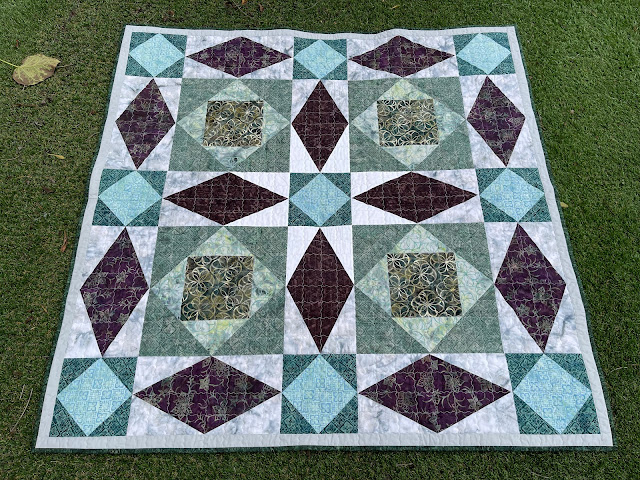 |
| Finished!!! |
 |
| Detail |
 |
| Almost Perfect Points :-) |
 |
| Challenge Met |
 |
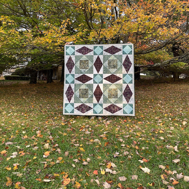
| Beautiful Day |
 |
| Contrast Backdrop |
 |
| Bright Foliage Backdrop |
 |
| Quilting Detail |
I was surprised when Paul asked for the completed quilt.
Paul: Absolutely.
Me: Why?
Paul: It reminds me of one of my games - The Invisible Sun.
Me: You just named the quilt.
I am so glad that Paul likes it. To be honest (and humble), I like it too. It is not my usual color palette (cheerful, playful, energizing, bright and happy) but it conveys peacefulness and an introspective vibe.
 |
| The Invisible Sun |
One thing is certain - If it wasn't for the Island Batik challenge I would not have worked with this palette and would not have discovered the potential of these colors to create an almost meditative quality. What do you think?
I will be sharing with all my favorite linky parties. See full list on the sidebar.


The full list of Ambassadors’ names, collections they will be using in their projects, and their post dates are as follows:
November 1:

Gail Sheppard, Quilting Gail
Preeti Harris, Sew Preeti Quilts
November 2:

Pamela Boatright, Pamela Quilts
Jane Hauprich, Stitch by Stitch Custom Quilting
November 3:

Denise Looney, For the Love of Geese
Megan Best, Bestquilter
November 4:

Gail Renna, Quilt Haven Threads
Claudia Porter, Create with Claudia
November 5:
Blog Hop Round-Up Week 1 and Giveaway
November 8:

Mania Hatzioannidi, Mania for Quilts
Jennifer Fulton, Inquiring Quilter
November 9:

Joanne Hart, Unicorn Harts
Connie Kauffman, Kauffman Designs
Jennifer Eubank, Archipelago Quilting
November 10:

Jennifer Thomas, Curlicue Creations
Janet Yamamoto, Whispers of Yore
November 11:

Emily Leachman, The Darling Dogwood
Maryellen McAuliffe, Mary Mack Made Mine
November 12:
Blog Hop Round-Up Week 2 and Giveaway
November 15:

Elizabeth DeCroos, Epida Studio
Andi Stanfield, True Blue Quilts
November 16:

Brianna Roberts, Sew Cute and Quirky
Michelle Roberts, Creative Blonde
November 17:

Sally Manke, Sally Manke Fiber Artist
Leah Malasky, Quilted Delights
Suzy Webster, Websterquilt
November 18:
End of Blog Hop and Total Round-Up
To celebrate the start of Storm at Sea Blog Hop, Island Batik is giving away a 2.5″ Strip Pack and a 10″ Stack of Bellingham Bay – a gorgeous premiere Original Island Batik collection, designed by Deb Tucker’s Studio 180 Design!
I wouldn't have chosen this palette either, Pretti, but you have made a beautiful quilt with it. I agree it's restful and calming, and not at all stormy. Congratulations!
ReplyDeleteOh wow, it is just gorgeous! I also love your photos with such lovely fall backgrounds. It's fun when you discover something that works for you when you didn't really expect it. Thanks for the inspiration!
ReplyDeleteIt’s beautiful and those colors are so rich. Nicely done.
ReplyDeleteIt's beautiful and a very calming palette, quite the opposite of mine, if I ever finish it. We all need a little calm in our lives. Very nice.
ReplyDeleteIt's beautiful, Preeti! I love it, and I agree that it feels meditative and sedate in the best ways. So glad Paul likes it so you will be keeping it around. And it looks stunning against that backdrop of fall foliage!
ReplyDeleteit is a pretty quilt but I think it would be hard to make a quilt with colors not of your choosing and a pattern that you didn't pick out yourself - you did a great job though!
ReplyDeleteSpectacular quilting on an eye catching quilt! It's no wonder that Paul wanted it. Thanks for sharing.
ReplyDeleteConnie
Beautiful quilt, Pretti! Storm at Sea is my favorite pattern. I love the movement. Your color palette was a surprise for me. I think of Caribbean colors or Atlantic seas off New England. Your palette completely works! I can’t wait to see the results of the other Island Batik collections.
ReplyDeleteGorgeous quilt! I love storm at sea but those fabrics were a bit of a challenge but you slayed it. I am so glad Paul loves it and named. It really is fun to see it in a different color palette.
ReplyDeletePretty quilt.
ReplyDeleteWhile these aren't my favorite colors, Preeti, I do LOVE this quilt!! The way you used them made it beautiful! Storm at Sea is one of my favorite patterns!
ReplyDeletePreeti, I feel the same way about darker greens. They are definitely not among my fabric choices nor are they happy to work with. You've done a fabulous job of putting them together to create a very meditative and moody quilt...one that Paul loves and gives off that slow-down, wait-for-the-storm-to-pass feeling. WEll done!
ReplyDeleteIt's a lovely quilt, even if it isn't your favorite colors. I do agree that it has a calming vibe to it. It turned out beautiful, and perfect for fall!
ReplyDeleteI think your quilt is very nice - the lighter colors keep it from being "depressing". It has such a nice look to it.
ReplyDeleteIt is not my typical go-to palette, either, but your quilt is beautiful. I guess that is why Island Batik has several different bloggers showing quilts made with their fabric lines. :)
ReplyDeleteYour quilt turned out lovely! In spite of you not loving the fabrics! :-)
ReplyDeleteWell done! It is a harder challenge to work outside of our colour zone, but you created a wonderful quilt for someone else to enjoy!
ReplyDeleteI too would have chosen one of the other colour packages to work if if I could chose :)
I think your quilt came out beautiful. The colors are tranquil and the size of your block are much bigger that I have seen before. I bet it went together pretty fast. Job well done.
ReplyDeleteIt is not my favorite group of colors either and I think you made them work together well - they really are somewhat calming and meditative. Congrats! xo
ReplyDeleteI think the way you used the lighter colors in the fabric collections mixed in with the darker ones makes this beautiful quilt anything but dark and depressing, Preeti! It's soothing and tranquil, and I love that Paul wanted it!
ReplyDeleteHi Pretti! The SAS pattern is one of my favorite yet-to-be-made quilt patterns. The Bellingham Bay collection looks so earthy and those greens remind me exactly of sea glass. So, to wrap up these thoughts (finally) you picked the perfect pattern using the perfect fabrics. LOVE! While they're not your colors per se, just think of what Lake Michigan looked like with all the high winds recently. You can see a picture on Thursday in my Loves post or you can take my word for it that they match Bellingham Bay. Even the dark browns. Not depressing but real life! And you know I'm a bright fabric palette fan, too, usually. Lovely job and I'm so glad that Paul has claimed it. {{Hugs}} a bunch. ~smile~ Roseanne
ReplyDeleteWow, it did turn out beautifully! Sometimes it’s hard to imagine how certain colors will interact and the moods they will convey. This is a great example that beautiful things can come from fabrics you may not expect!
ReplyDeleteMeditative - that is a lovely way of describing the feeling of this group of colors. It’s so pretty!!! And how sweet that your husband loves it so much!
ReplyDeleteThis turned out great
ReplyDeleteAh, I love this story ending. Paul knows what he likes. Meditative, yes. And the aqua is like a misty jewel in the greens—perhaps just like the atmosphere of western Washington on a foggy morning. The quilt looks especially beautiful in that last photo among the yellow trees. Yay for you rising to the challenge!
ReplyDeleteYour quilt turned out lovely!
ReplyDeleteTurned out wonderful.
ReplyDeleteIt is a beautiful quilt and the colours are lovely. Also love the way you quilted it.
ReplyDeleteanother home run! as you know i love the subdued colors and use them alot in my work. It always brings a sense of comfort and peace while working with it. Barbara
ReplyDeletePaul's new quilt is SEW beautiful!! You did a magnificent job with the fabrics provided, Preeti. Here's hoping Paul will share with you! :o))
ReplyDeletePerhaps it is a cloud across the sun, or a little fog like we are having here this morning, and not a full blown storm. Very nice.
ReplyDeleteSo beautiful!!
ReplyDeleteGorgeous! These are my colors, I call them PNW fog. Home. I will order them 🙃
ReplyDeleteBeautiful quilt Preeti, I am happy both you and Paul like the colours.
ReplyDeleteIt turned out great. I'm not a fan of this colour scheme either, but the prints are wonderful. Well done.
ReplyDeleteStorm at Sea has always been on my list yet I've never made one. Yours is a delight. Congrats, Preeti.
ReplyDeleteYou did a stellar job of making a calm storm-at-sea, Preeti!!! Love the purple in there. It's nice that Paul sees the merits in it!!!
ReplyDeleteI'm so happy you went with this, even though the subdued fabric palette wasn't to your liking... and it looks amazing! I too love the purple, the dark value amongst the other fabrics keeps the eye moving so that the quilt seems to twinkle.
ReplyDeleteI think this is beautiful. I find it curious that sometimes when I look at it, the quilt design seems to curve. If I don't look too long, I feel like you used some curved piecing. Then when I study it, I see the basic squares, triangles and rectangles. Anyway, it is a very cool effect. Well done!
ReplyDeleteI think it is beautiful and restful. If it didn't have the blues at the center of the square in a square, and then the plum to play off of that, it might be glum, but I think it has a lightness to it now. wordygirl at earthlink dot net
ReplyDeleteI love the colors. Good job working with colors you're not really fond of. That's a wonderful finish.
ReplyDeleteYou have designed and stitched a beautiful quilt from those fabrics. It is hard to come up with something when you are not a fan of the colours in the fabrics. I am always amazed how quickly you whip up your lovely quilts!
ReplyDeleteIt's beautiful, nothing depressing about it! I love those colors:)
ReplyDeleteYou did a great work, Preeti, your quilt is beautiful.
ReplyDeleteWhile not my palette either, it is a stunning quilt in its own calm way! How can calm and stunning be in the same sentence?? Paul has great taste!
ReplyDeleteWhile purple is my favorite color, I would never have said this was a dark and depressing collection. The deep greens, light jade, and cool blues are meditative and inviting. Your quilt reflects the beauty of this collection. Thanks for sharing on Wednesday Wait Loss.
ReplyDelete