Saturday, June 26, 2021

Purple, Positivity and Pain

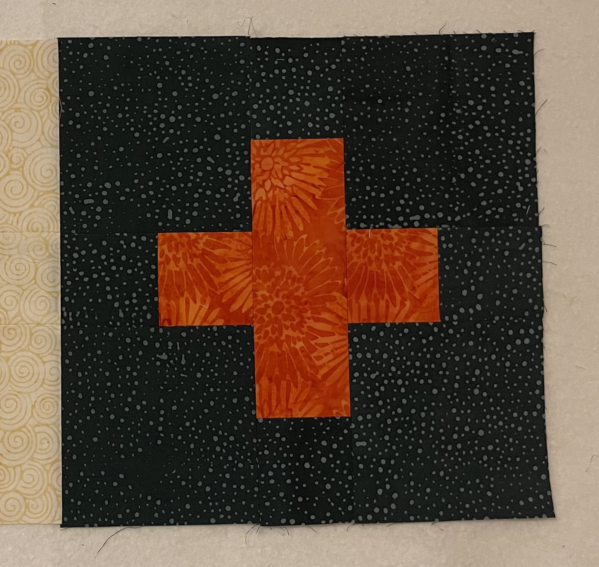
The Purple blocks for June RSC 2021 are complete. YIPPEE!!! Here they are:


Reddish Purple


Bluish Purple


True-ish Purple

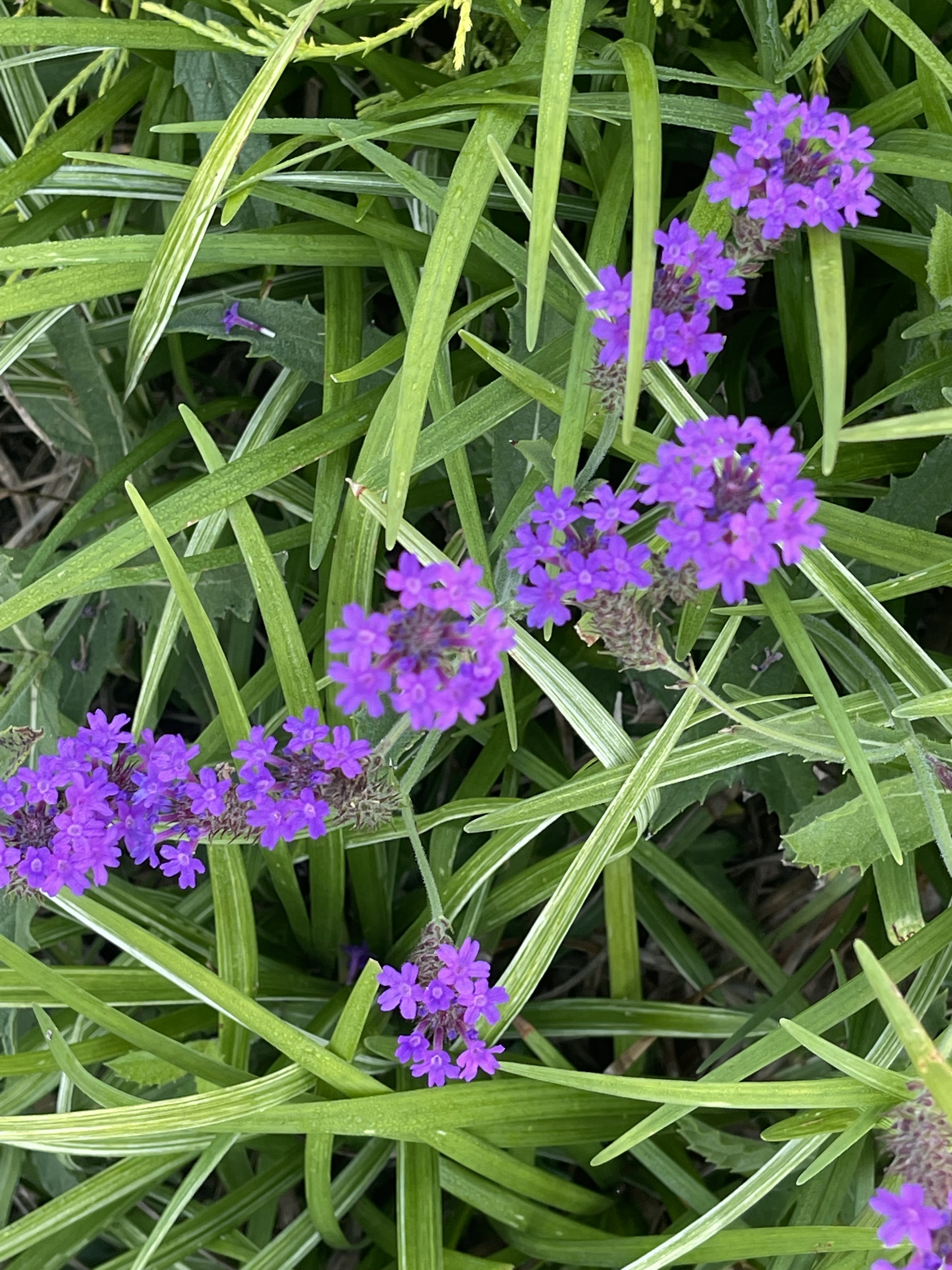
Since I had purple on  my mind, I saw purple everywhere and lots of it. Here are a few glimpses.

Hydrangeas


Allium something - Ornamental Onion 

Purple and Hairy Leaves!!!


I saw a Purple Wall!!!

In Berlin, MD

Noticed this sign on vacation in Berlin, MD


A purple butterfly!!!

Pansies :-) 

O Beautiful - Don't know thy name

One purple shell on the pathway to The Inn Berlin

Do you like Dark?

Or Light


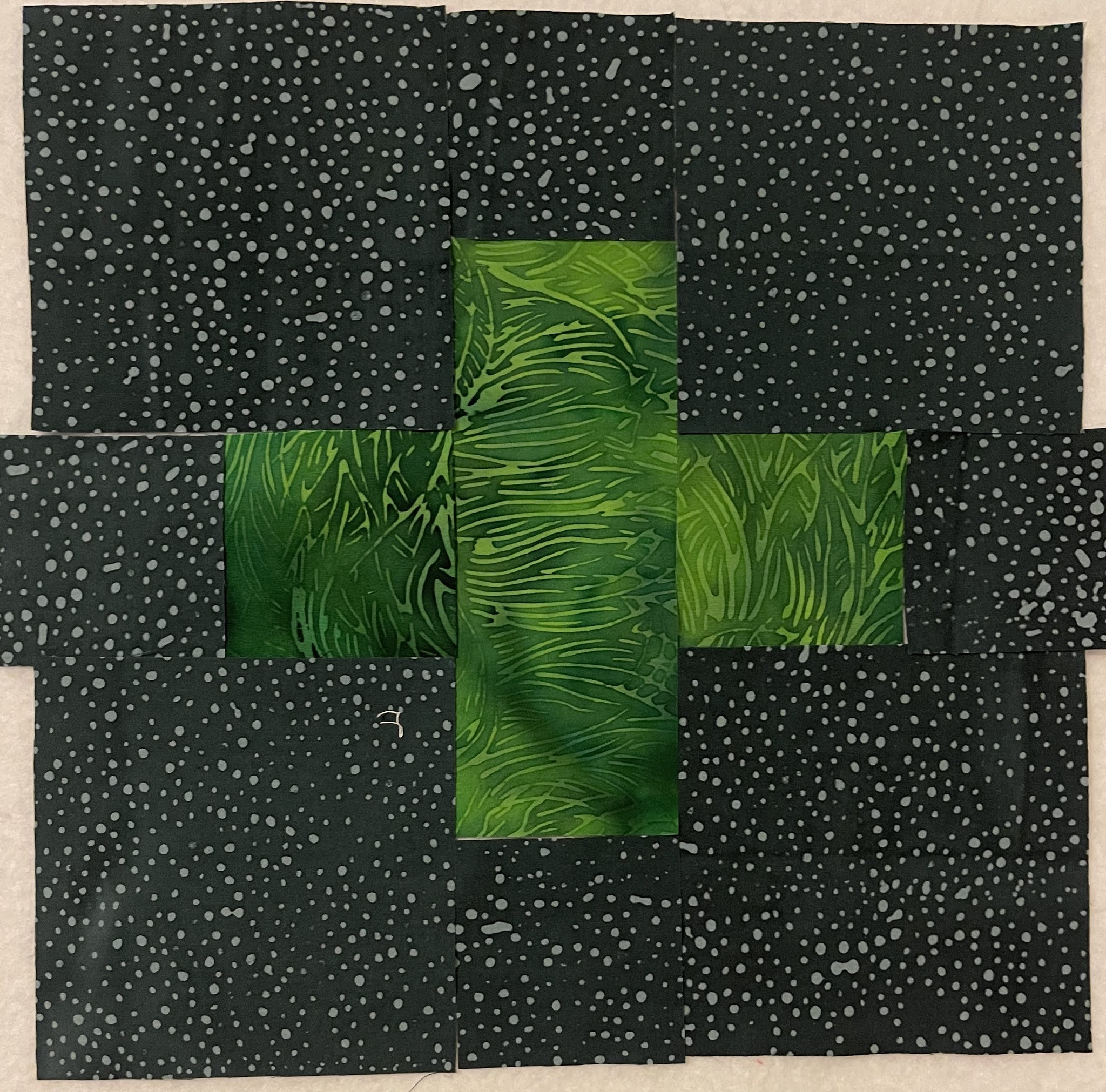
Here are the secondary blocks, using the triangle leftovers from the snowballed squares in the Sisters Choice Blocks. 

Secondary Blocks


19 done and 11 to go.

I am sure they will make an adorable baby quilt :-) Linking with Angela's Linky Party.

___________________________________________________________________


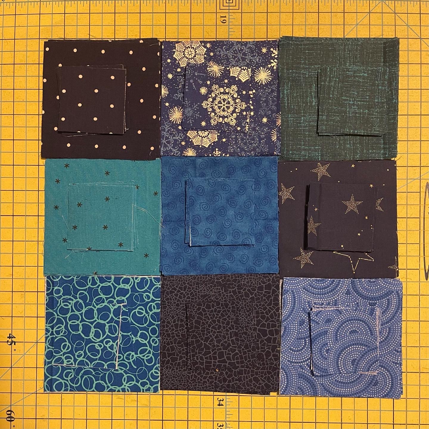
I chose red, white and blue for my Mercyful Quilt.


The Reds 

The Blues (for the border)
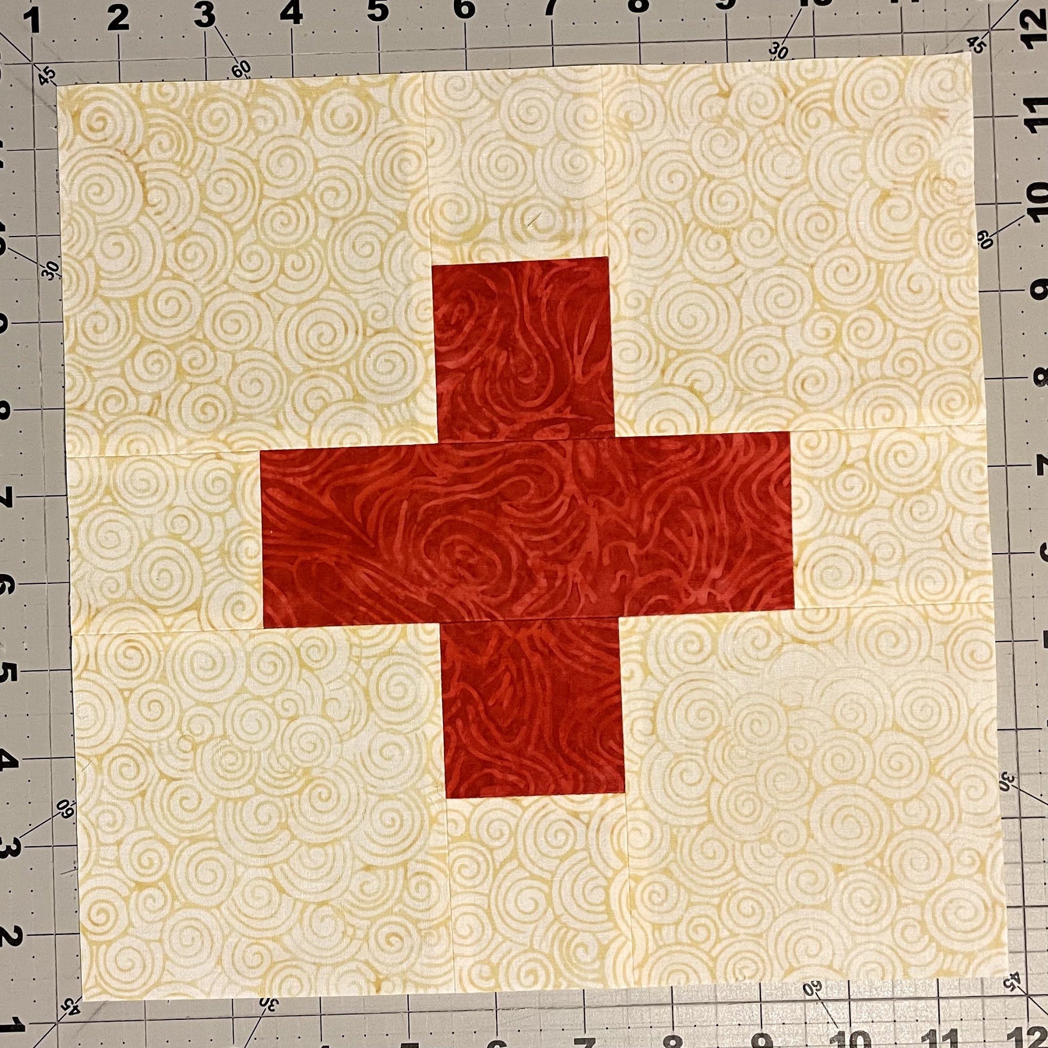
24 Border Blocks

In process - Red Blocks with snowballs

Although I have completed the flimsy, I will share it later in the QAL in the July 18 Linky Party. 

OK, fine. Here is a peek :-)


__________________________________________________________________


And lastly the pain. The pain of rejection.

Curated Quilts had announced the Polygon Mini Challenge using the colors Navy, Rust, Olive Green, Almond, Ash and Cream. Square not to exceed 16" and any technique.

I dived in - utterly and completely. I made not one but four minis. Each distinctly different, using a different technique.  Well, see for yourself.

1. Wedge Issues - So many polygons!!!

Improv Pieced, 15" Square


2. Happy Hour - Post Covid get-together with girl friends!!!

Raw Edge Appliqué, 14" Square


3. Segmented - In our echo chambers, we remain divided.

Quilt as You Go, 14.5" Square

4. Zahra - Imagining a trip to Morocco

Paper Pieced, 14" Square


Each one was rejected. EVERY. SINGLE. ONE.

I was deeply disappointed... It was impossible not to be when I had poured myself into the challenge.  

I know I must be detached from the outcome. I know that I must focus only on the effort and not fixate upon the rewards, Hindu scriptures tell me. But I am a work in progress and not there yet.

All my darlings - Love you so much!!!

Someone had the soul-crushing task of rejecting these lovelies.  I feel very sorry for them.

_______________________________________________________________________


Then Paul and I went on a mini vacation and I could not dwell upon the pain any more. Here are a few glimpses from our weekend. We stayed at The Inn Berlin. I cannot recommend this place enough.  Maya's Eggs Benedict can really make the world seem a better place. 

Eggs Benedict by Maya Tomasello, The Inn Berlin


And it is impossible to be sad when the sea breeze is whipping your hair into a frenzy.  

Chincoteague Boat Tour


Pelicans posed for us :-)

We watched the birds and horses up close. We even saw a few dolphins but they were too quick and could not be captured in an image.  The white horse in the picture below was just being lazy. He got up later. 

Horses gathered together for a photo


We went to a Water Park in Ocean City. Initial hesitation turned into glee and laughter as we experienced different rides and myriad ways of landing/splashing/thrashing into the water. 


Splash Mountain in Ocean City

Happy and Exhausted

The day ended with some yummy seafood.

Bacon Wrapped Scallops

We visited the Windmill Creek Winery.  The Mariner's House is beautifully maintained and the visitors are free to visit, take a glass of wine and sit anywhere inside or outside under the mulberry trees (which were laden with fruit at this time) and there was a tree swing. Yes, a TREE SWING!!!.

Well-maintained Mariner's House

Stepping back in time


I enjoyed several minutes on the tree-swing which brought back childhood memories and I was happy as can be :-)  

I am a kid...


Goofiness at Windmill Creek Winery

Picture Perfect - I am All Yours


This was out first post Covid vaccination and it was divine!!!

_______________________________________________________________________

In other news (and there is plenty of it) I have received the second box of Island Batik goodies. The video is coming on July 22, 2021.  I have completed the July challenge for Island Batik and that post is coming next. Novella, the Table Runner is going to be a pattern. Sarah, JoleeKatrin, Maya, and Yvonne have graciously agreed to test my pattern. Thank you ladies. You are awesome!!!

I am sure I am forgetting something...

Oh yes. Feedburner is going away. To ensure that you don't miss any of my posts, please follow me on Bloglovin.  Sometime later in July I will have a giveaway (Details Coming).  Extra chances if you follow me on Bloglovin and Instagram. 

I'd love to hear your thoughts, be they purple, painful or positivity-laden.  Reading your comments gives me a feeling similar to the sea breeze in my hair :-)  I will be sharing with all my favorite linky parties. See full list on the sidebar. 


Sunday, June 13, 2021

The Positivity QAL - Choosing Fabrics

Imagine a large buffet like Golden Corral (Paul's favorite).  With over fifty items on the table, does it really matter if two or three items are blah?  You will only taste 4-5 items, may be 10 if you are more adventurous. Ahem!!!

Now imagine a simple meal of tomato soup and grilled cheese. Everything must be fresh and tasty and well-seasoned. There is no room for blah. It could ruin the entire meal.

Such is this simple Plus Block. With only two main fabrics, it is important that they work well together. 

Plus Fabrics (Background Pending)


I remember spending an entire semester in Architecture on Color Theory. I remember assignments using only primary colors and then learning about hues, tones, tints and shades. 

There are plenty of free and paid resources to learn about Colors and how to pick them and how to use them. But at the end of the day, what really matters is this - does it look good? Do you like it?


Yellow Plus, Cream Background Added


Dark Green Plus, Smoke/Dark Background Added


Here is my one golden rule. The 10-foot rule. If it looks good from 10 feet away, it is good.  
So let's step away about 10 feet.


Does it look good?

I have been struggling to write this post, because I do not wish to "tell" you what to do. I just want you to know the consequences of your decisions.

In the case above, the plus shape almost melts into the background. If you prefer a very subtle contrast, then this may appeal to you. If you prefer that the plus shape stand out (a little or a lot) then keep reading.


Contrast is what heightens our conclusions and appreciations. Just like we appreciate a cold drink so much more on a hot day, so also the contrast makes the shapes appear stronger or muted.  If you like a "gentle nudge", use a subtle contrast. If you want "a slap in your face", use a strong contrast. And use the 10-foot rule to see the difference.


Next I switched the backgrounds.


Light Yellow Plus on Dark Background


Dark Green Plus on Cream Background

Closeups can be deceptive. So let's step away 10 feet.


Does this appeal to you?

If you like a very strong contrast then the above fabric combinations may speak to you. 

Here are the two pictures next to each other.

You pick which ever works for you.

Of course very strong contrasts and very subtle contrasts are easy to spot.  
When in doubt, step away 10 feet.  In fact, always confirm by stepping away. Trust me, you perceptions will change when you step away, sometimes dramatically.


I used Island Batik fabrics to make these demo blocks, using Cream (Island Batik Foundation Yolk) and and Gray (Island Batik Foundation BE32-E1).
Subtle Contrast


Very Sharp Contrast

Very Sharp Contrast

Very Sharp Contrast

Sharp Contrast

Medium to Sharp Contrast

Subtle to Medium Contrast

I wonder how they appear all together.

Which one appeals to you?


And now?

Do you see how the corn yellow on cream becomes subtler when we step away 10 feet.  


Let's take a look at the dark blocks now.

Subtle to Medium Contrast

Subtle to Medium Contrast

Very Sharp Contrast

Medium Contrast

Medium Contrast


And all together. 

What stands out to you?


And now?

Do you notice that the top left corner block has a subtler contrast now that we stepped away 10 feet?  
Compare that to the bright green on the right middle row. 

Similar colors can have very different contrasts based on their value (lightness or darkness). Remember the 10-foot rule.

I have struggled to write this post.  It seemed to me that this was basic information that most quiltmakers already know. To those I say - please ignore this post. 

And for those who may benefit from this information, I am glad to be of help. 


Paul: Don't you like to tell folks what to do?
Me: I am just sharing my insights.
Paul: Sounds like teaching.
Me: NO. I am not telling folks what to do. I am merely pointing out that if you want a savory dish, add salt. If you want a sweet dish, use honey or sugar.
Paul: Reads like a recipe
Me: Whether they eat salty or sweet foods, is up to them. 
Paul: Oh ok.
Me: Glad you understand, finally.
Paul: So I read through this Quilt All Together thing.
Me (suppressing a smile): Quilt Along?
Paul: Yes, that. It is free.
Me: Completely.
Paul: Can you control who sees it or who uses it.
Me: Anyone with internet access can see it and use it.
Paul: Anyone can use your design and all this "salt/savory" information all for free.
Me: Correct.
Paul: How can you make sure that folks will make quilts and send to charity?
Me: I am sure some people will :-)
Paul: And why should they?
Me: We are offering prizes to folks who do.
Paul: But still not all who use your instructions will.
Me: That is correct.
Paul: And you still want to do it, even when you know that some will misuse it?
Me: YES, yes, absolutely yes.
Paul: WHY?
Me: Because I firmly believe that a couple of people misusing this information does not negate all those quiltmakers who will use this for a good cause.  Because I believe that the good in the world still outweighs the evil. 
Paul: You do know that we have many such people in this country who believe otherwise?
Me: Yes, there are folks in this country who'd argue against a good program in the fear that it may be misused by a few while ignoring the benefit it will bring to many.
Paul: I don't think it is fear. It is Greed.
Me: Yes, it is. And we both know who they are. I am NOT one of them.
Paul: You go ahead. I'll be cheering you on.
Me: Cool. Cause I need to get back to choosing fabrics :-)


If you have questions, please ask. I will respond in the comments so that all can see.