Showing posts with label Value. Show all posts

Wednesday, June 28, 2023

Window Dressing & Pattern Release

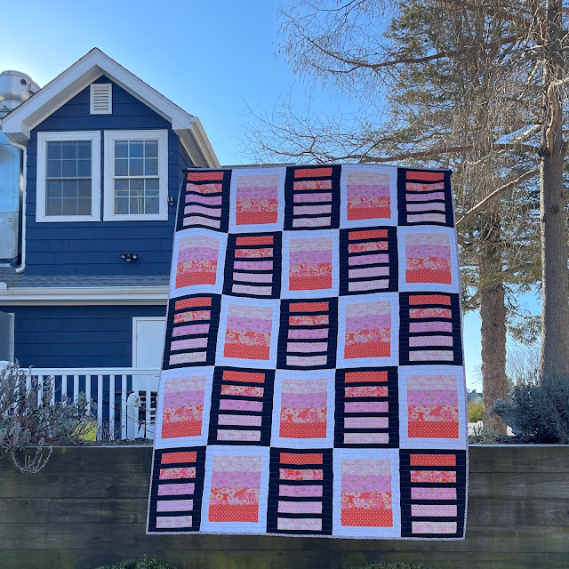
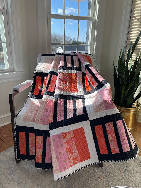
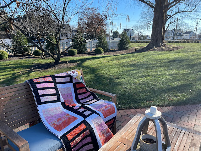
Window Dressing was published in March 2023 in Make Modern Issue #51, in the category of Prints Charming! I smile every time I read that :-)

Made with Ruby Star Society Fabrics (Reverie by Melody Miller) provided by Moda, it is a simple design that exploits the value gradations for maximum effect. Put another way, the Prints Charming did the heavy lifting and I gathered the compliments :-)


Cold Day, Warm Quilt

For some reason, the blog publication of this quilt slipped through the cracks. But here we are now.  

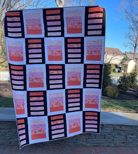
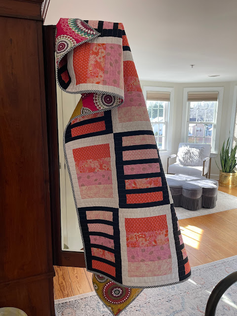
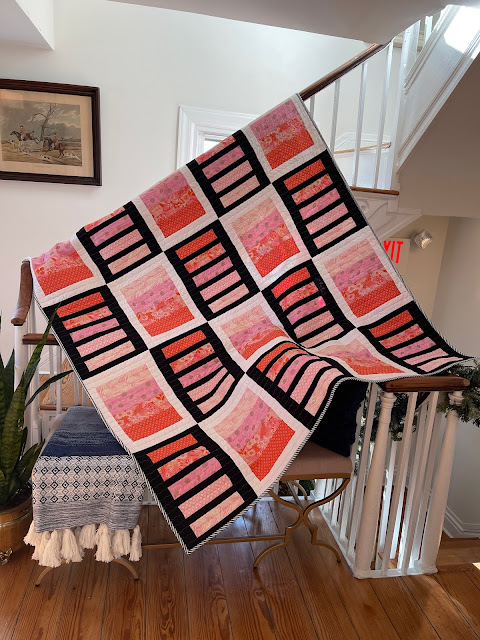
Window Dressing finished at 60" by 80", making it a perfect size for lap/throw/picnic and even Mercyful Quilts. The simple pattern uses black and white solids in alternating blocks, highlighting the changing values. 

Gradations Galore


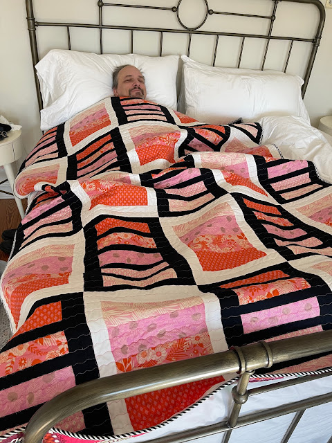
As a model-photographer team, our roles are reversible.  If it is a larger quilt, it is practical for Paul to be the model and if it is a smaller quilt, I like to smile from behind it, while he takes the pictures.

I took Window Dressing to Berlin, MD for our Christmas mini vacation. On a particularly cold morning, as Paul wanted to sleep in and I was itching to get out and take pictures, this happened.  


Paul, the reluctant model

There is more than one way to model a quilt :-D  

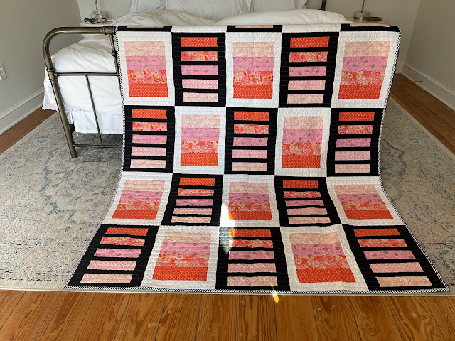
The low sun lit our room beautifully, with ample opportunities for indoor pictures. 

Window Dressing


Sunlit Room


No, I do not belong in the closet!


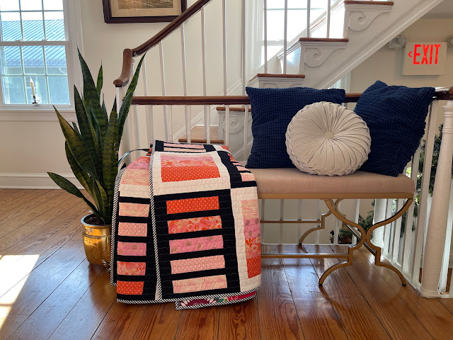
There was a a small reading nook/snack area just outside our room. It provided a perfect staging area for the quilt. 

So Cozy

All these pictures were taken at the Inn Berlin in Berlin, MD. It is an upscale Bed and Breakfast place that is also completely gluten-free. No, we do not have such dietary restrictions but I love it, all the same.


I love it here!

Window Dressing Quilt Pattern is now available in my Etsy Shop for an introductory price of $8, till July 4, 2023. 

I can get used to this!


In other news, Angela has announced that July is Red. I am ahead of the game, at least this time :-)

July is Red 


I will be sharing with all my favorite linky parties, including Angela's. See full list on the sidebar.

Thursday, January 27, 2022

Island Batik Step by Step Challenge

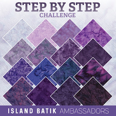
 The Island Batik challenge for January 2022 reads as follows: 

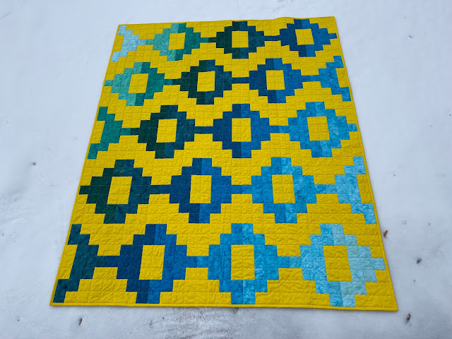
Island Batik has developed ten colorways of gradations with 20 steps in each. There are so many quilt projects that make use of gradations in color and value. Your challenge is to create a project that demonstrates this step by step change in color value!


I love this challenge. I absolutely do. I love creating quilts with gradations, where color (or value) gradually changes from one to the other. I made a Gradations quilt in Konark, even though it wasn't a requirement. Cross Currents was based on the same theme. Even the Iberian Lynx Project relies on gradually darkening values to convey the message of strengthening populations.


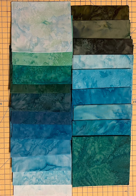
Tantalizing Teals :-)


I received the letter for the 2022 Ambassador Program in December 2021. I had recently completed my Synergy Quilt for the Make Modern magazine. As I read the requirements of the first challenge, I wondered - how would Synergy look with changing values of blue and green (instead of rainbow colors in the original)? Absolutely snazzy, said EQ8!


I wasted little time in cutting fabric but when I started cutting the grey background fabric, it did not feel right. Neither white nor black were giving me the warm fuzzy feeling I was looking for. Back to EQ8. Yellow it was!!! Although I had plenty of solid neutrals (Black, White and Grey). I had very little yellow solid. Within minutes, I ordered solid yellow. Now I had to sit tight and wait. So many gorgeous teals and I had to wait??? UNACCEPTABLE.


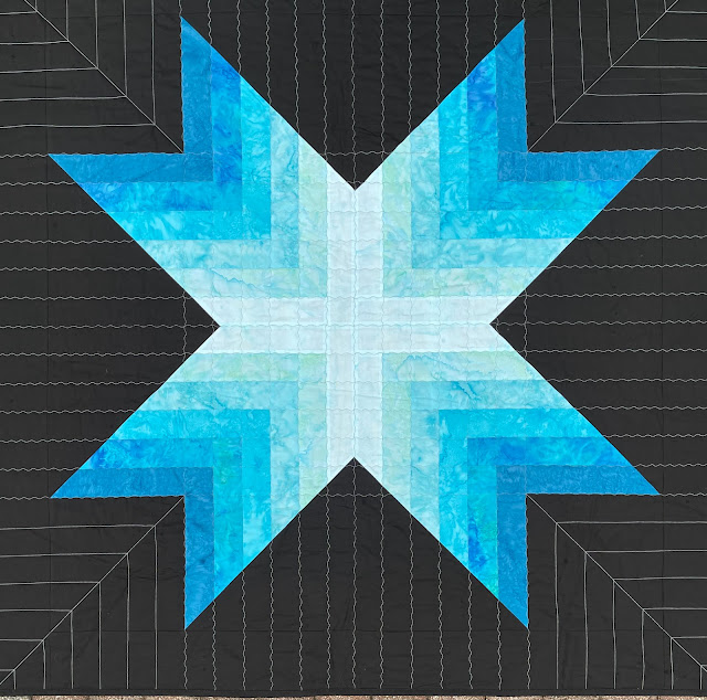
So, while I was waiting for the yellow solid fabric to arrive, I made this other quilt with the step by step gradations theme.  I am calling this one Supernova :-)


Supernova


I know I am crazy. But look at these tantalizing teals. Do you really blame me? I was hungry and Gradations is my favorite food group :-D


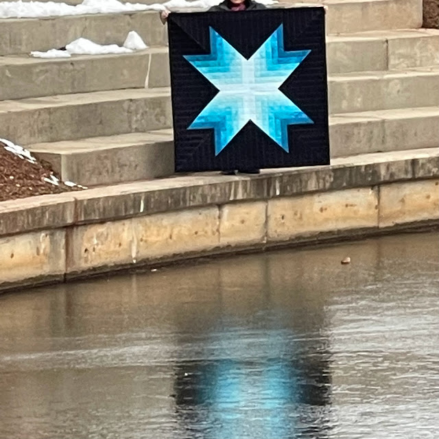
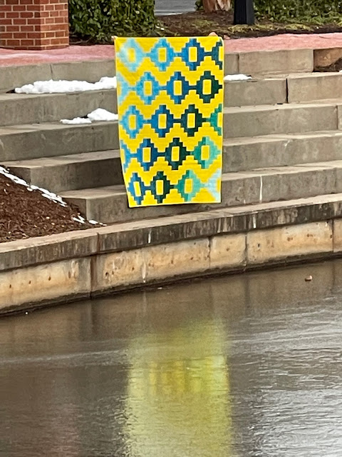
Frozen Pond = Poor Reflections :-(


I used Hobbs Thermore batting. This is my favorite batting because it is really light and so easy to work with. I used Schmetz Microtex 80/12 needles for both piecing and quilting. I used Aurifil Thread (40 wt) #2600 Dove for quilting.
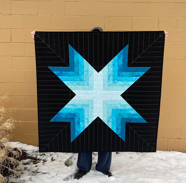
Here are a few more pictures.


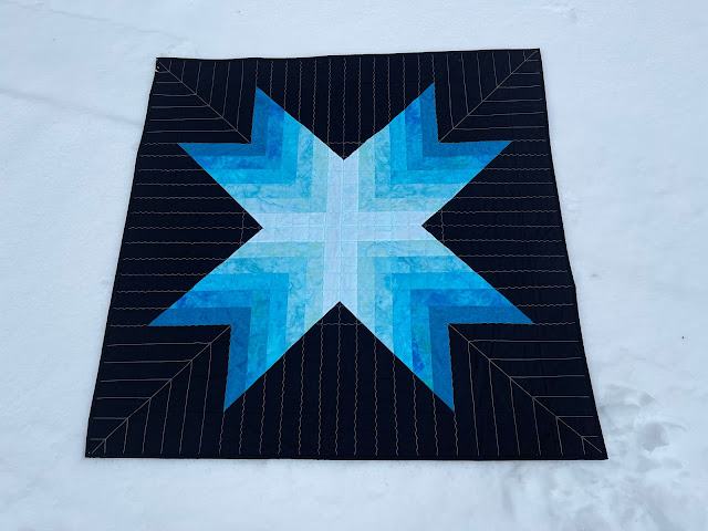
Supernova on Snow


Thank you Paul!


Yummy Fabrics - Step by Step


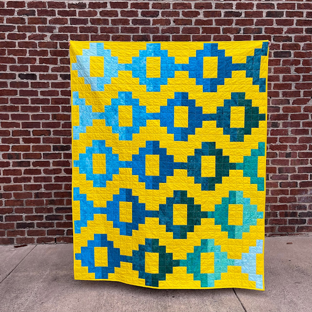
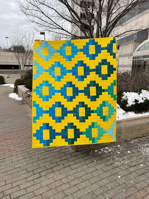
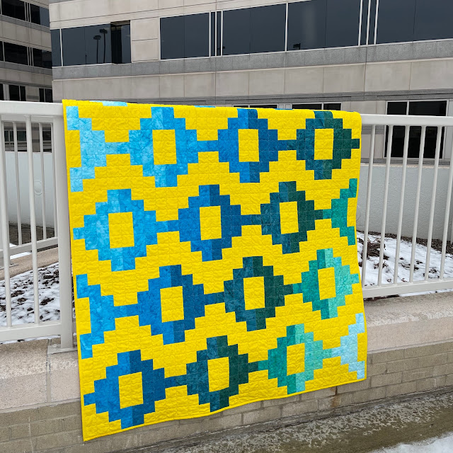
Once yellow solid arrived (thanks to a rapid response from Maryellen), I made Synergy in Tantalizing Teals with a Solid Yellow background.  I used Hobbs Premium 80/20 Cotton batting and quilted with Aurifil thread (40 wt) using the Schmetz Microtex 80/12 needle.


The Yellow sings and the Teals dance on the hot surface. And I am thrilled with this song and dance quilt!!!


Jubilant Quilt - Dull Reflection


I wanted a reflection of this simmering yellow in a cool pool, but alas all ponds are frozen resulting in blah reflections. May be in a couple of months, I will try again.

Against a red brick wall will do nicely

Winter is cold, Quilt is Hot

Snow does make a great setting

Dreary Urban Backdrop = Perfect for a Bright Quilt


Supernova finished at 52" square and Synergy (in Tantalizing Teals) finished at 56" by 70". Quilted using my walking foot. Used background fabrics for both bindings. Overall, I am very happy with my January, except the frozen bit. But enough about me. I'd love to hear from you. I will be sharing with all my favorite linky parties. See full list on the sidebar.


The Island Batik February Challenge and Blog Hop begins on January 31. I will be posting on February 16. You don't want to miss it. 

The other Island Batik Ambassadors are busy posting their “Step by Step” challenge quilts.
Do check them out. 

Disclosure: The fabrics, batting, thread and needles were generously supplied by the following companies: Island Batik   Aurifil Thread   Hobbs Batting & Schmetz Needles !!


Sunday, September 26, 2021

Workshop with Gloria Loughman

More often than not, quilt guild workshops are on weekdays and are not conducive to those of us not yet retired from our day jobs. But when the guild arranged a two-part workshop with Gloria Loughman on two weekends (9/11 and 9/18), I wasted no time and signed up for it.  


I bought the recommended pattern and downloaded the instructions. I watched the videos and read the downloaded pattern sheets. That was in July. 

Come September, I am buried deep in Island Batik October Challenge.  It has been rather all-consuming.

Improvisational Piecing

Iberian Lynx Silhouette


So when the Gloria Loughman workshop started at 3:30 on Saturday afternoon, I joined on Zoom but continued working on the Iberian Lynx project (Island Batik October Challenge). 

The workshop was terrific. Gloria is an excellent teacher with lots of examples from her work. She would explain a few things and then give 30 minutes for sewing, while she was available to answer questions, give feedback and make suggestions.  

Me: I am so torn.
Paul: What's up?
Me: I really want to work on this "Light up your Landscape" project.
Paul: So why don't you?
Me: I am in the middle of something else.
Paul (looking at the class materials): With all those light and dark colors, it is neat. 
Me: That is exactly why I want to dive in. 
Paul: There are so many guns held at your head but the only hand holding them is yours.

He has a point. 

I focused the next few days (Sunday - Wednesday) on completing the top for the Iberian Lynx project (Island Batik October Challenge). Then I dropped it to make the Landscape quilt.  My hope was to have something done before the second part of the workshop on following Saturday, 9/18.


Tiles Cut

Arranging Tiles

Brick by Brick

Completed Sky

From Thursday through Saturday afternoon, I focused on the workshop project.  When it was time for Workshop - Part 2, I was fully focused. No distractions. 

Choosing foreground

I showed my progress to Gloria. She approved. I worked on the different elements of the landscape during the 30 minute sewing sessions.


Completed Sky Sewn!!!


Island Batik for foliage

By the end of the workshop, I was so far along that I had to finish it. 

I have named it Gul Mohar, because the yellow/orange blooms are like those of the Gul Mohar tree, common in India. 

Gul Mohar

Of course, some of you may want to get up close and personal. Here you go :-)


But truly, the effect of light appears best when viewed from a distance. 


I am loving it and I am so glad that I took the plunge. I highly recommend Gloria Loughman's workshop. She is an accomplished artist and a terrific teacher. 

Gul Mohar finished at 13" by 19", and became my Dreami (Drop everything and make it) for September. Sharing with Sandra's Linky Party and all my favorite linky parties. See full list on the sidebar. 


Sunday, June 13, 2021

The Positivity QAL - Choosing Fabrics

Imagine a large buffet like Golden Corral (Paul's favorite).  With over fifty items on the table, does it really matter if two or three items are blah?  You will only taste 4-5 items, may be 10 if you are more adventurous. Ahem!!!

Now imagine a simple meal of tomato soup and grilled cheese. Everything must be fresh and tasty and well-seasoned. There is no room for blah. It could ruin the entire meal.

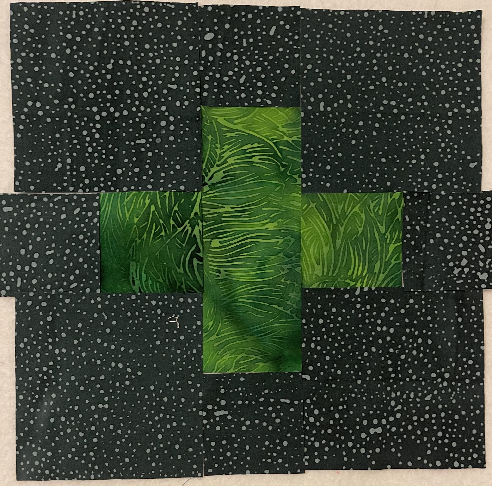
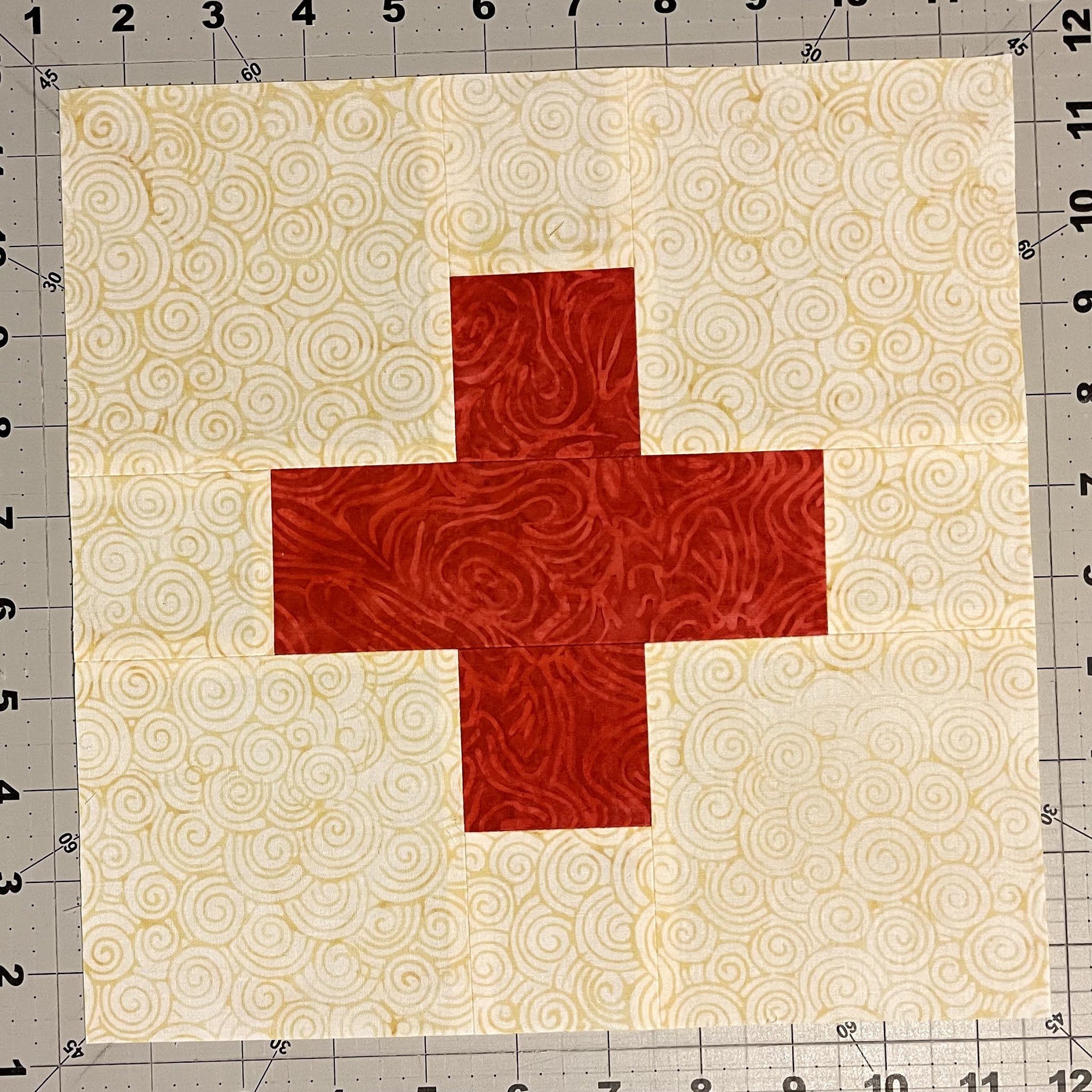
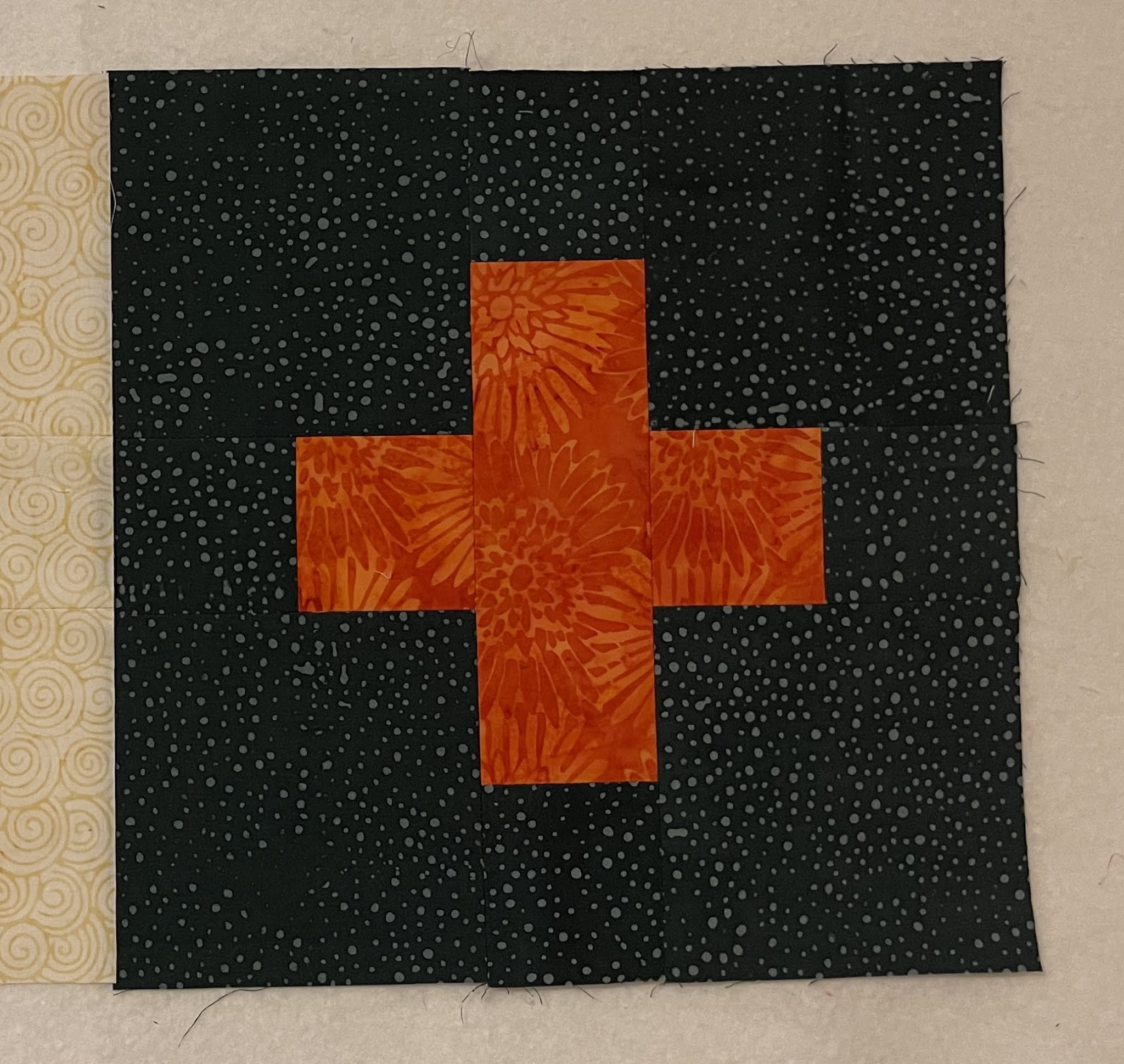
Such is this simple Plus Block. With only two main fabrics, it is important that they work well together. 

Plus Fabrics (Background Pending)


I remember spending an entire semester in Architecture on Color Theory. I remember assignments using only primary colors and then learning about hues, tones, tints and shades. 

There are plenty of free and paid resources to learn about Colors and how to pick them and how to use them. But at the end of the day, what really matters is this - does it look good? Do you like it?


Yellow Plus, Cream Background Added


Dark Green Plus, Smoke/Dark Background Added


Here is my one golden rule. The 10-foot rule. If it looks good from 10 feet away, it is good.  
So let's step away about 10 feet.


Does it look good?

I have been struggling to write this post, because I do not wish to "tell" you what to do. I just want you to know the consequences of your decisions.

In the case above, the plus shape almost melts into the background. If you prefer a very subtle contrast, then this may appeal to you. If you prefer that the plus shape stand out (a little or a lot) then keep reading.


Contrast is what heightens our conclusions and appreciations. Just like we appreciate a cold drink so much more on a hot day, so also the contrast makes the shapes appear stronger or muted.  If you like a "gentle nudge", use a subtle contrast. If you want "a slap in your face", use a strong contrast. And use the 10-foot rule to see the difference.


Next I switched the backgrounds.


Light Yellow Plus on Dark Background


Dark Green Plus on Cream Background

Closeups can be deceptive. So let's step away 10 feet.


Does this appeal to you?

If you like a very strong contrast then the above fabric combinations may speak to you. 

Here are the two pictures next to each other.

You pick which ever works for you.

Of course very strong contrasts and very subtle contrasts are easy to spot.  
When in doubt, step away 10 feet.  In fact, always confirm by stepping away. Trust me, you perceptions will change when you step away, sometimes dramatically.


I used Island Batik fabrics to make these demo blocks, using Cream (Island Batik Foundation Yolk) and and Gray (Island Batik Foundation BE32-E1).
Subtle Contrast


Very Sharp Contrast

Very Sharp Contrast

Very Sharp Contrast

Sharp Contrast

Medium to Sharp Contrast

Subtle to Medium Contrast

I wonder how they appear all together.

Which one appeals to you?


And now?

Do you see how the corn yellow on cream becomes subtler when we step away 10 feet.  


Let's take a look at the dark blocks now.

Subtle to Medium Contrast

Subtle to Medium Contrast

Very Sharp Contrast

Medium Contrast

Medium Contrast


And all together. 

What stands out to you?


And now?

Do you notice that the top left corner block has a subtler contrast now that we stepped away 10 feet?  
Compare that to the bright green on the right middle row. 

Similar colors can have very different contrasts based on their value (lightness or darkness). Remember the 10-foot rule.

I have struggled to write this post.  It seemed to me that this was basic information that most quiltmakers already know. To those I say - please ignore this post. 

And for those who may benefit from this information, I am glad to be of help. 


Paul: Don't you like to tell folks what to do?
Me: I am just sharing my insights.
Paul: Sounds like teaching.
Me: NO. I am not telling folks what to do. I am merely pointing out that if you want a savory dish, add salt. If you want a sweet dish, use honey or sugar.
Paul: Reads like a recipe
Me: Whether they eat salty or sweet foods, is up to them. 
Paul: Oh ok.
Me: Glad you understand, finally.
Paul: So I read through this Quilt All Together thing.
Me (suppressing a smile): Quilt Along?
Paul: Yes, that. It is free.
Me: Completely.
Paul: Can you control who sees it or who uses it.
Me: Anyone with internet access can see it and use it.
Paul: Anyone can use your design and all this "salt/savory" information all for free.
Me: Correct.
Paul: How can you make sure that folks will make quilts and send to charity?
Me: I am sure some people will :-)
Paul: And why should they?
Me: We are offering prizes to folks who do.
Paul: But still not all who use your instructions will.
Me: That is correct.
Paul: And you still want to do it, even when you know that some will misuse it?
Me: YES, yes, absolutely yes.
Paul: WHY?
Me: Because I firmly believe that a couple of people misusing this information does not negate all those quiltmakers who will use this for a good cause.  Because I believe that the good in the world still outweighs the evil. 
Paul: You do know that we have many such people in this country who believe otherwise?
Me: Yes, there are folks in this country who'd argue against a good program in the fear that it may be misused by a few while ignoring the benefit it will bring to many.
Paul: I don't think it is fear. It is Greed.
Me: Yes, it is. And we both know who they are. I am NOT one of them.
Paul: You go ahead. I'll be cheering you on.
Me: Cool. Cause I need to get back to choosing fabrics :-)


If you have questions, please ask. I will respond in the comments so that all can see.