Imagine a large buffet like Golden Corral (Paul's favorite). With over fifty items on the table, does it really matter if two or three items are blah? You will only taste 4-5 items, may be 10 if you are more adventurous. Ahem!!!
Now imagine a simple meal of tomato soup and grilled cheese. Everything must be fresh and tasty and well-seasoned. There is no room for blah. It could ruin the entire meal.
Such is this simple Plus Block. With only two main fabrics, it is important that they work well together.
 |
| Plus Fabrics (Background Pending) |
I remember spending an entire semester in Architecture on Color Theory. I remember assignments using only primary colors and then learning about hues, tones, tints and shades.
There are plenty of free and paid resources to learn about Colors and how to pick them and how to use them. But at the end of the day, what really matters is this - does it look good? Do you like it?
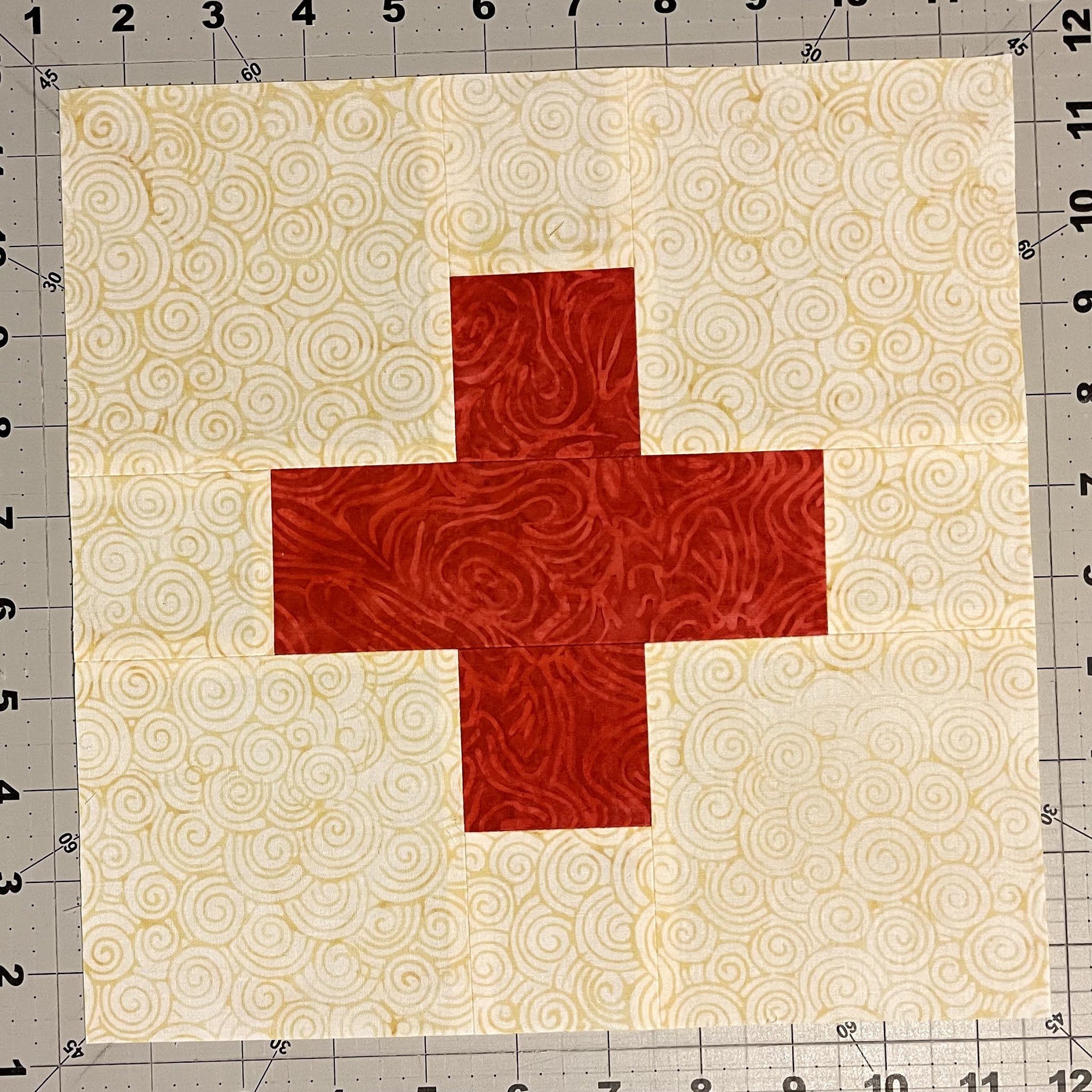
 |
| Yellow Plus, Cream Background Added |
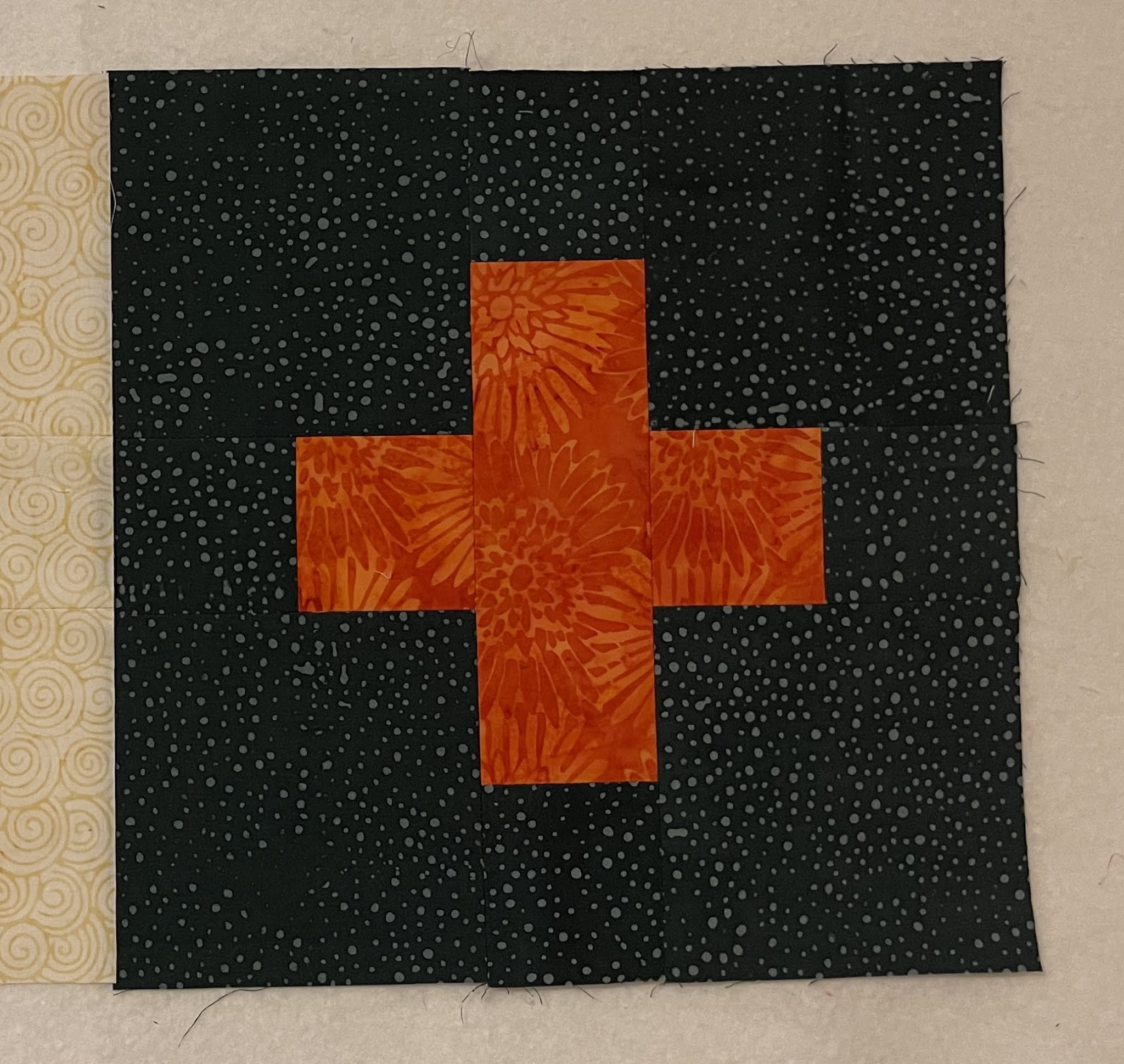
 |
| Dark Green Plus, Smoke/Dark Background Added |
Here is my one golden rule. The 10-foot rule. If it looks good from 10 feet away, it is good.
So let's step away about 10 feet.
 |
| Does it look good? |
I have been struggling to write this post, because I do not wish to "tell" you what to do. I just want you to know the consequences of your decisions.
In the case above, the plus shape almost melts into the background. If you prefer a very subtle contrast, then this may appeal to you. If you prefer that the plus shape stand out (a little or a lot) then keep reading.
Contrast is what heightens our conclusions and appreciations. Just like we appreciate a cold drink so much more on a hot day, so also the contrast makes the shapes appear stronger or muted. If you like a "gentle nudge", use a subtle contrast. If you want "a slap in your face", use a strong contrast. And use the 10-foot rule to see the difference.
Next I switched the backgrounds.
 |
| Light Yellow Plus on Dark Background |
 |
| Dark Green Plus on Cream Background |
Closeups can be deceptive. So let's step away 10 feet.
 |
| Does this appeal to you? |
If you like a very strong contrast then the above fabric combinations may speak to you.
Here are the two pictures next to each other.
You pick which ever works for you.
Of course very strong contrasts and very subtle contrasts are easy to spot.
When in doubt, step away 10 feet. In fact, always confirm by stepping away. Trust me, you perceptions will change when you step away, sometimes dramatically.
I used Island Batik fabrics to make these demo blocks, using Cream (Island Batik Foundation Yolk) and and Gray (Island Batik Foundation BE32-E1).
 |
| Which one appeals to you? |
 |
| And now? |
Do you see how the corn yellow on cream becomes subtler when we step away 10 feet.
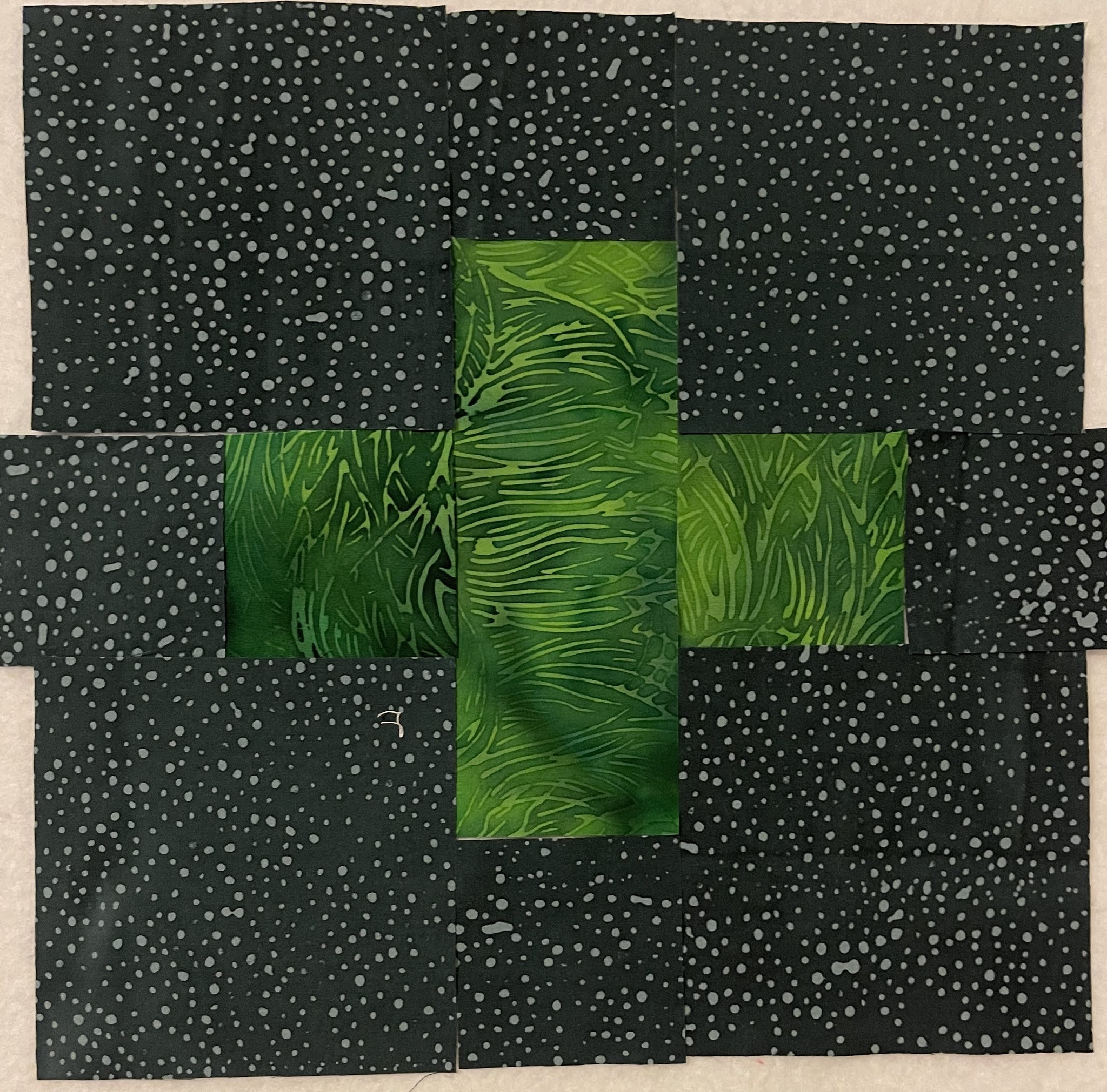
Let's take a look at the dark blocks now.
 |
| Subtle to Medium Contrast |
 |
| Subtle to Medium Contrast |
 |
| Very Sharp Contrast |
 |
| Medium Contrast |
 |
| Medium Contrast |
And all together.
 |
| What stands out to you? |
 |
| And now? |
Do you notice that the top left corner block has a subtler contrast now that we stepped away 10 feet?
Compare that to the bright green on the right middle row.
Similar colors can have very different contrasts based on their value (lightness or darkness). Remember the 10-foot rule.
I have struggled to write this post. It seemed to me that this was basic information that most quiltmakers already know. To those I say - please ignore this post.
And for those who may benefit from this information, I am glad to be of help.
Paul: Don't you like to tell folks what to do?
Me: I am just sharing my insights.
Paul: Sounds like teaching.
Me: NO. I am not telling folks what to do. I am merely pointing out that if you want a savory dish, add salt. If you want a sweet dish, use honey or sugar.
Paul: Reads like a recipe
Me: Whether they eat salty or sweet foods, is up to them.
Paul: Oh ok.
Me: Glad you understand, finally.
Paul: So I read through this Quilt All Together thing.
Me (suppressing a smile): Quilt Along?
Paul: Yes, that. It is free.
Me: Completely.
Paul: Can you control who sees it or who uses it.
Me: Anyone with internet access can see it and use it.
Paul: Anyone can use your design and all this "salt/savory" information all for free.
Me: Correct.
Paul: How can you make sure that folks will make quilts and send to charity?
Me: I am sure some people will :-)
Paul: And why should they?
Me: We are offering prizes to folks who do.
Paul: But still not all who use your instructions will.
Me: That is correct.
Paul: And you still want to do it, even when you know that some will misuse it?
Me: YES, yes, absolutely yes.
Paul: WHY?
Me: Because I firmly believe that a couple of people misusing this information does not negate all those quiltmakers who will use this for a good cause. Because I believe that the good in the world still outweighs the evil.
Paul: You do know that we have many such people in this country who believe otherwise?
Me: Yes, there are folks in this country who'd argue against a good program in the fear that it may be misused by a few while ignoring the benefit it will bring to many.
Paul: I don't think it is fear. It is Greed.
Me: Yes, it is. And we both know who they are. I am NOT one of them.
Paul: You go ahead. I'll be cheering you on.
Me: Cool. Cause I need to get back to choosing fabrics :-)
If you have questions, please ask. I will respond in the comments so that all can see.


Very good reminders for even the most seasoned of QAL participants. Paul is very sweet in his concern for what people may do with your work - good thing most of us are utterly honest!
ReplyDeleteYou are teaching us and doing a great job of it, too! I've made that "not enough contrast" mistake so many times and not realized it until I stepped back or looked at a photo of some blocks. Now I'll remember to step back 10 feet!
ReplyDeleteGreat advices, always usefull, do not listen to Paul ;) I'm going with high contrast!
ReplyDeleteYou're teaching, but in a gentle manner. This is good. I never thought about the 10 foot rule, but have applied it - now I have a name! As for folks misusing your pattern, you have the right attitude. Don't worry about what you can't control. My quilt is intended for charity, but if it makes your hubby feel better, tell him there are many of us use patterns we pay for to make charity quilts. So maybe it all balances out in the end?
ReplyDeleteWhen in doubt, I find the "do you like it" question helps a LOT!
ReplyDeleteThe 10 foot rule seems like a great idea! I'll remember that in future as I want my "work" to shine like yours!
ReplyDeleteThat’s a great rule! And it works!
ReplyDeleteThe 10 foot rule is a great helper. Taking a picture or looking through the eye of the camera helps sometimes too. Oh, and turning the picture into a black and white version. I was surprised what I learned about that with my last quilt. So even "us seasoned folks" need the reminders once in a while :)
ReplyDeleteI am off to stand 10 feet away from my choices. Thanks!
ReplyDeleteSo many of us have been choosing fabric for quilts for so long that we have developed an instinct for what will go and what won't -- we don't think about why. It's helpful to have an analysis.
ReplyDeleteI love the reminder to presume good will! I do sell some of my quilts but what might not be apparent to others is that I donate the proceeds to charity. While some can use quilts, most other charities need funds.
ReplyDeleteI always enjoy your blog - there are teaching moments, things you share & conversations you've had with your hubby that are adorable. I love that he pays attention to what you're doing & why -- and worries if others will be taking advantage of you in the process. If that isn't love I don't know what is! I'm a 45+ year quilter, and I still enjoy your teaching moments, and yes, sometimes I learn something, too. Don't know about anyone else, but I love learning something new, and hope I always will. I give 99% of my quilts away, so yes, I WILL be giving any quilts I make from your pattern/ideas away to others.
ReplyDeleteI was away at a quilt retreat over the weekend and haven't yet chosen all my fabrics or done any cutting. I think I know what backgrounds I'm using, so your "lessons" on contrast will come in handy as I choose the colors for the plus signs. Your generosity and giving nature is what makes you so special.
ReplyDeletePat
Great post Preeti, we can always learn something new or have our memory nudged. 😄 thank you for your generous spirit.
ReplyDeleteI am a high contrast person. Will sometimes go for "medium" contrast but it has to "hit" me that it is OK. Another conversation with Paul--:-)
ReplyDeleteInteresting also how the strong + on the pale background looks smaller than the pale + on the darker background. And I'm with you on sharing knowledge freely. Good people will do good with it, and bad people may use it selfishly, but you can't control what other people do, nor do you need to try. The sharing is enough.
ReplyDeleteWell Preeti, this is incredibly helpful to me. I do have trouble with picking colors/fabrics. I am grateful you took the time to write such an informative post. Tell Paul quilters are amazing, generous people - this QAL will bring lots of donations quilts to completion. :-)
ReplyDeleteI do love me some low contrast - that's my usual combo, but there are always cases where the other works better, no matter your preference. Thanks for the reminder, professor!
ReplyDeleteBeautiful
ReplyDelete