Showing posts with label color gradation. Show all posts

Wednesday, June 28, 2023

Window Dressing & Pattern Release

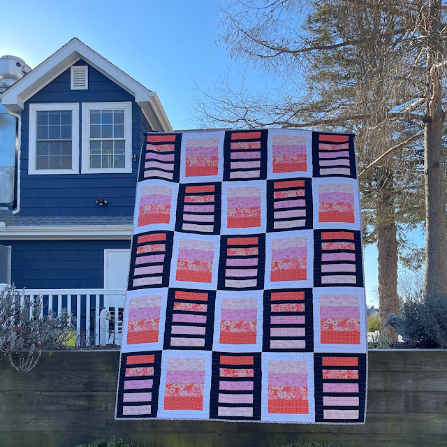
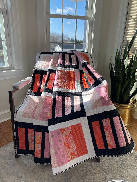
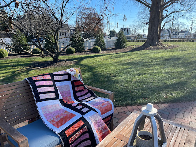
Window Dressing was published in March 2023 in Make Modern Issue #51, in the category of Prints Charming! I smile every time I read that :-)

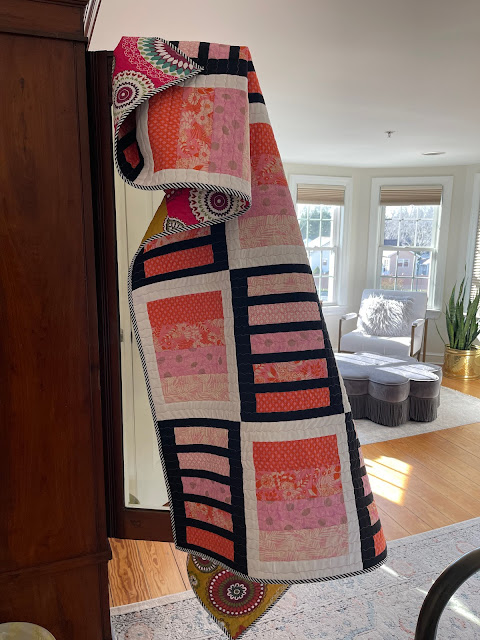
Made with Ruby Star Society Fabrics (Reverie by Melody Miller) provided by Moda, it is a simple design that exploits the value gradations for maximum effect. Put another way, the Prints Charming did the heavy lifting and I gathered the compliments :-)


Cold Day, Warm Quilt

For some reason, the blog publication of this quilt slipped through the cracks. But here we are now.  

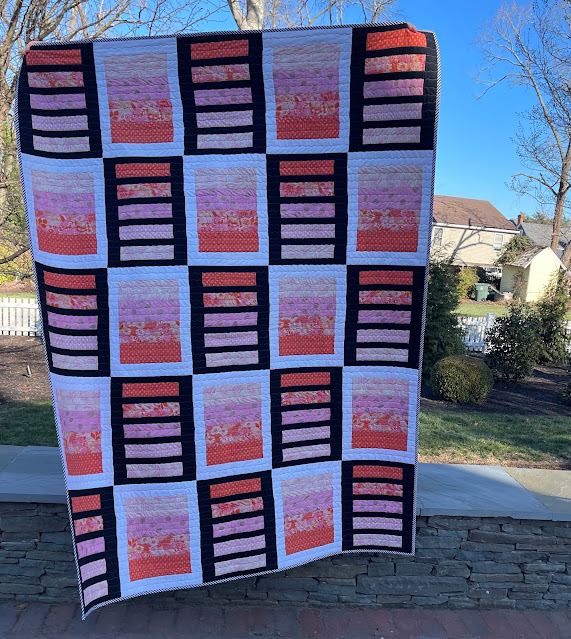
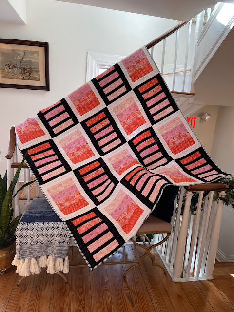
Window Dressing finished at 60" by 80", making it a perfect size for lap/throw/picnic and even Mercyful Quilts. The simple pattern uses black and white solids in alternating blocks, highlighting the changing values. 

Gradations Galore


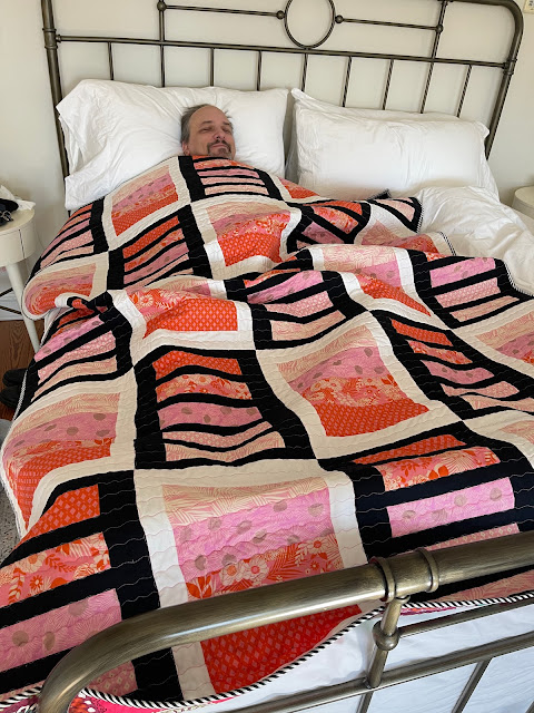
As a model-photographer team, our roles are reversible.  If it is a larger quilt, it is practical for Paul to be the model and if it is a smaller quilt, I like to smile from behind it, while he takes the pictures.

I took Window Dressing to Berlin, MD for our Christmas mini vacation. On a particularly cold morning, as Paul wanted to sleep in and I was itching to get out and take pictures, this happened.  


Paul, the reluctant model

There is more than one way to model a quilt :-D  

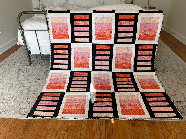
The low sun lit our room beautifully, with ample opportunities for indoor pictures. 

Window Dressing


Sunlit Room


No, I do not belong in the closet!


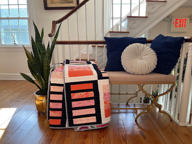
There was a a small reading nook/snack area just outside our room. It provided a perfect staging area for the quilt. 

So Cozy

All these pictures were taken at the Inn Berlin in Berlin, MD. It is an upscale Bed and Breakfast place that is also completely gluten-free. No, we do not have such dietary restrictions but I love it, all the same.


I love it here!

Window Dressing Quilt Pattern is now available in my Etsy Shop for an introductory price of $8, till July 4, 2023. 

I can get used to this!


In other news, Angela has announced that July is Red. I am ahead of the game, at least this time :-)

July is Red 


I will be sharing with all my favorite linky parties, including Angela's. See full list on the sidebar.

Sunday, October 23, 2022

Diwali Lights

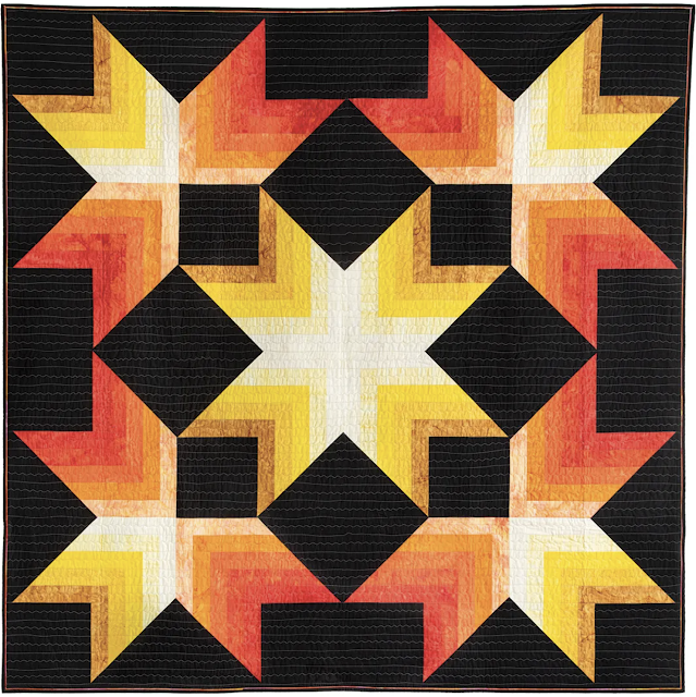
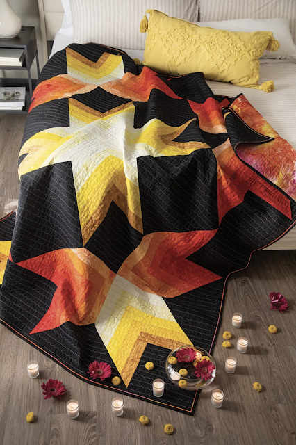
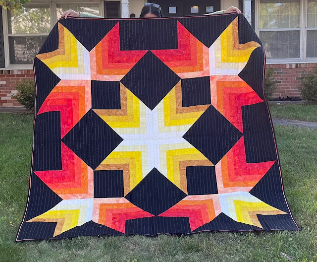
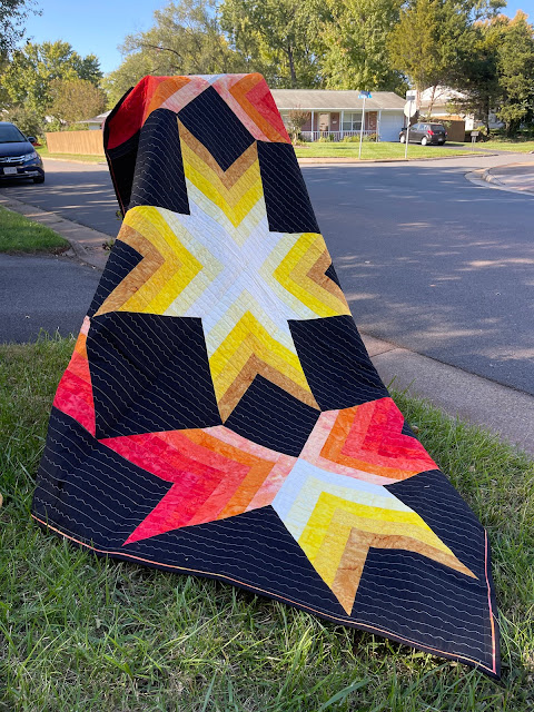
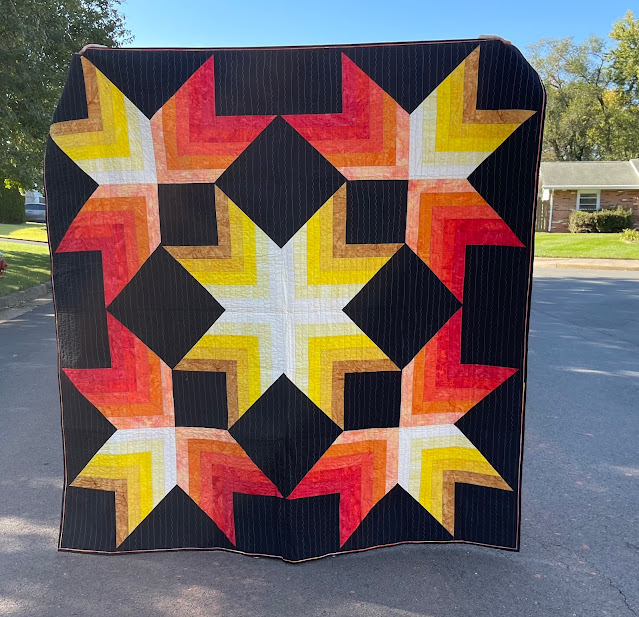
Diwali Lights designed, pieced and quilted by me is in the November/December issue of the Quiltmaker Magazine.

Picture by Quiltmaker

The journey of this quilt began in January of this year, when I submitted the pattern to the Quiltmaker magazine. When I received the acceptance email, I was thrilled but realized that I won't be able to meet the March deadline (for publication in the September/October issue) due to other engagements. 


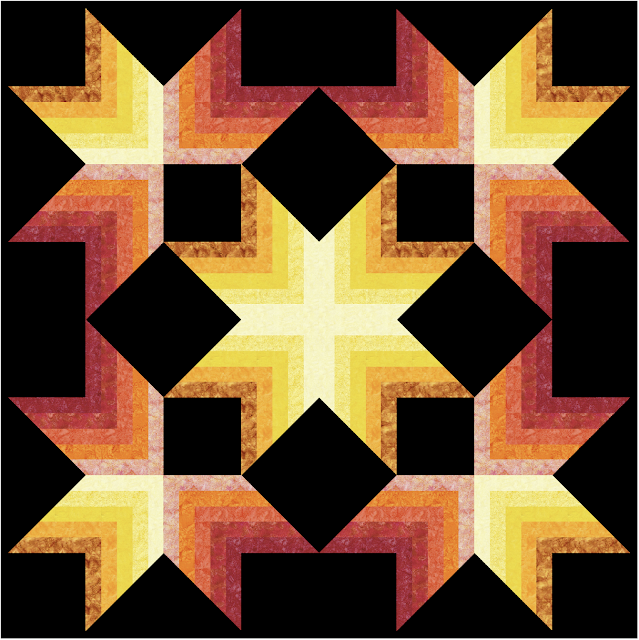
Mock-up in EQ8


Quiltmaker honored my request and agreed to delay the publication to November/December issue and I had until May to make and send the quilt.

Picture by Quiltmaker

This just works beautifully because the magazine is published shortly before the Diwali festival. Since Diwali is based on the lunar calendar, the date is not fixed.  This year Diwali falls on October 24. 


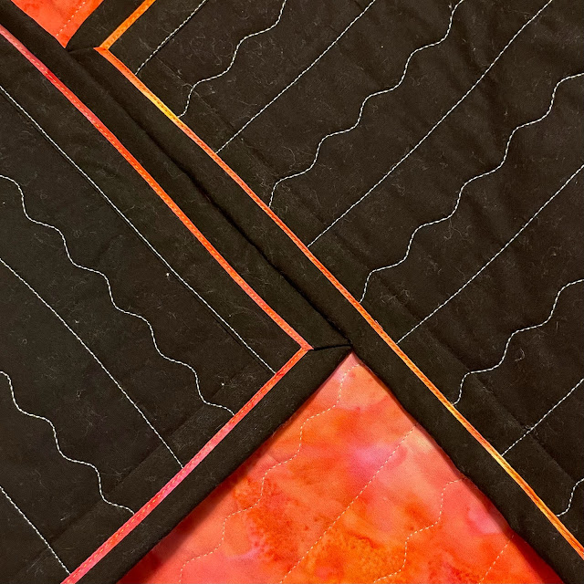
Faux piped binding & Quilting detail


It was a joy working with bright yellows and radiant oranges. All fabrics were provided free of charge by Island Batik.  It is good to be an ambassador :-)


Diwali Lights

Celebrated on a moonless night, Diwali or Deepavali is the festival of lights. The outward celebration focuses on lights and decorations, food and gifts, joy and merriment, but the true spiritual significance of Diwali is about the enlightenment of the soul, celebrating the inner awakening that can dispel the darkness of evil and ignorance.


Let it shine

In the quilt, Diwali Lights, I have tried to capture the concept of "inner light dispelling the darkness". 


Paul is the model

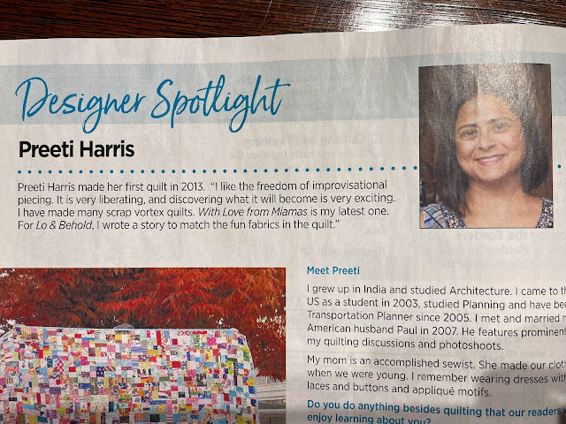
If you like the pattern, you can get it here for under $8. Better still get the whole issue for just under $10. The November/December issue includes several other gorgeous quilt patterns for Hanukkah, Festivus and Christmas. The November/December issue also includes a "Meet the Designer" feature on yours truly. I am so tickled :-)


From the Quiltmaker Magazine, November/December Issue

As Paul and I celebrate the festival of lights, we wish that this Diwali brings joy and happiness to all humanity by dispelling the darkness of ignorance and evil everywhere in the world.

I will be sharing with all my favorite linky parties. See full list on the sidebar.

Monday, March 14, 2022

Aurifil Color Builder Challenge - Innamorato

The March challenge is sponsored by Aurifil Threads.  Here are the simple guidelines to complete the challenge.


Create a piece inspired by your assigned Italian destination. It could be a city scene, a landscape, or something you associate with the location.

  • Size: 20” x 20” or under

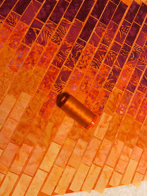
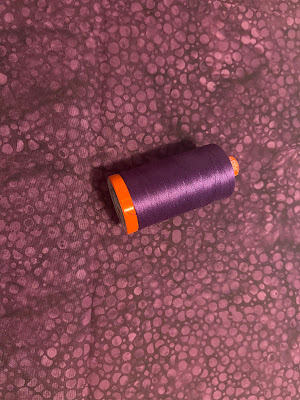
  • Must use each of the 3 thread spools from the Color Builder box, how the thread is used is up to the maker!

  • Utilize thread painting, some type of appliqué or a combination of the two


I chose orange for two reasons. 
1. I like orange :-) 
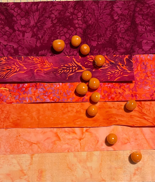
2. I had leftover orange fabrics from the Farm Fresh collection that would match perfectly with the Aurifil threads.

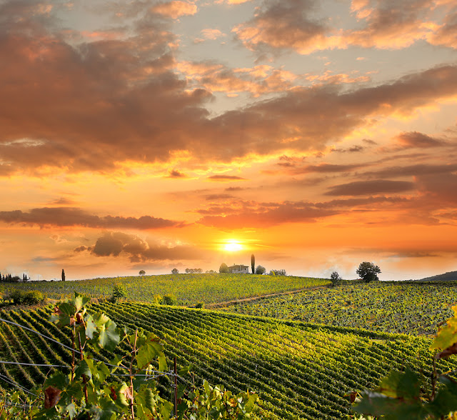
The following picture is provided by Aurifil for the Tuscany Orange Color Builder Thread set.


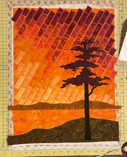
Such a beautiful sky in my favorite colors, I knew what I wanted to do.  Using the techniques learned in Gloria Loughman's class, I could create a landscape showing off those gorgeous sunny vibes.

Fabrics


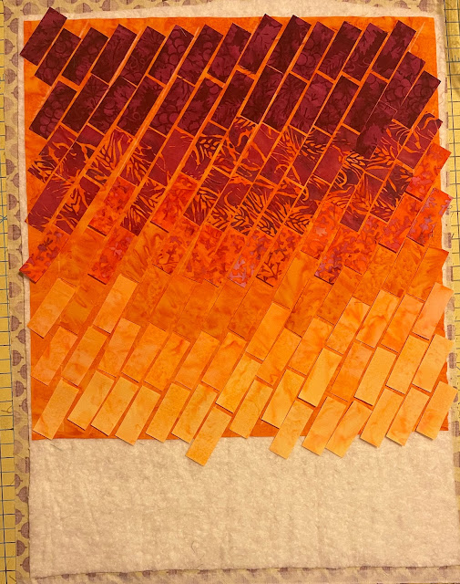
Work in Progress


I layered Island Batik Foundation Pumpkin as the base on top of the Hobbs Cotton Batting before adding the tiles for appliqué.  A 90/14 Schmetz Needle was perfect for securing the appliqué to the base.  


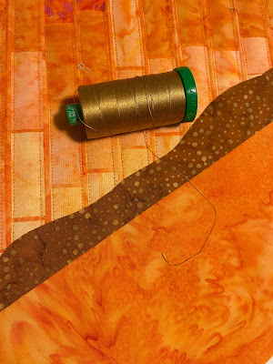
Time for Thread

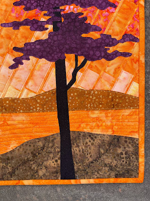
Hills and foreground were added. And then the tree. 

For the Hill

Tree Foliage


It was coming together nicely. The beautiful Island Batik fabrics and the gorgeous Aurifil Threads had captured the beauty of the Tuscan sunset. 


Almost there?


But something was missing. 

Looking at this gorgeous landscape, I knew I wanted to be there with Paul, exploring vineyards, walking hand in hand and soaking up the sun while basking in the warmth of his presence.  

Paul: It looks lovely.
Me: Hmm...
Paul: You don't seem happy.
Me: Something is missing.
Paul: What?
Me: The soul.
Paul: Huh?
Me: WE are missing. 

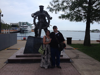
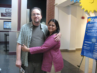
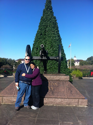
Adding a couple in silhouette would complete the picture. But not any couple. It had to be us. I rummaged through our pictures to find a suitable one.

Nah - too much going on

Nope - It will look like a blob

Same problem

When we get our pictures taken, the impulse is to get closer, but those pictures will not look good in a silhouette. I realized that we need to be close but not touching.

I could make this one work

I traced the outlines as two separate bodies. There was nothing romantic about that. And cutting out the silhouette was no fun either. I am sure my nose and chin are smooshed.  

Once completed, I stepped away to admire my handiwork. 

It is us!!!

Picturing the Future

I had goosebumps. Mission accomplished!

I was there. We were there. Someday we will be. 

Sitting in the living room, watching TV and eating dinner, I found myself looking into the studio area, staring dazedly at the picture of us. Paul noticed that I was not paying attention to "Resident Alien" on TV.

Paul: You are silly.
Me: Nah, I am crazy. About us.
Paul: I am too.
Me: Look at us.
Paul: I did. It is beautiful. 

Since I am in love with Paul and I love this finish, I have named it Innamorato, which means "in love" in Italian. I will be sharing with all my favorite linky parties. See full list on the sidebar. 

A few closeups.


Disclosure: The fabrics, batting, thread and needles were generously supplied by the following companies: Thank you, Island Batik, Aurifil Thread,  Hobbs Batting & Schmetz Needles.


Wednesday, July 31, 2019

Comeuppance

Last week, Paul and I went to watch the movie Men in Black.  I was underwhelmed.  As we stepped out, I sneezed.

On location


Me: AAAHHHTISHOOO...
Paul: Wow that was a big one
Me: (sniffle)
Paul: Your nasal passages are remarkably sonorous
Me: Uh huh
Paul: I am glad that was outside, otherwise they would have to fumigate the whole theater
Me (fed up with his teasing): Well, I could sneeze more daintily, but what is the point? I am already married.

That was my fitting response to his incessant teasing.
This quilt is my response to the challenges of paper-piecing. Hence the name - Comeuppance.

Comeuppance

Bob approves!!!

This quilt has been a very long time in the making.
The pattern is Trinket by Alison Glass. 


Choosing fabrics was fun but making the blocks was a mixed bag. Some were easy.  Others were tricky and yet others were absolute torture.

There were 10 blocks in each of the categories - Lines, Shapes, Things and Life.
Each and every paper-pieced block was made and shared on Instagram according to a pre-determined schedule, in order to be eligible for the weekly prizes.

LINES
Lines#4
I liked this block but wanted to explore how would it look with a range of values.

Lines #4 :-)
Is it a hat or a boat?
These were fun
The skinny strips were tricky.
Line #10
SHAPES

The arrows were easy.
Shapes#5

 These crosses were a bit tedious.
Shapes#8


Although these stars had several steps, I love the finished block.
Shapes#10

Why would I make two identical blocks?  Because instead of making the two halves as mirror images, I made them facing the same way.  So if you look close they are not identical but mirrored.


THINGS

These are a few of my favorite things!!!
Another boat shaped block - time to play with colors :-)
Things#2
 I enjoyed making this house block :-)
Things#7

This has so many little pieces but when it was done, all points matched. It was a miracle. I was in love!!! So perfect.
Things#10
LIFE

This was an interesting block. Very skinny vein in the middle, but overall it looks good.
Life#1


12 small pieces, four template units to make one block and the seams almost matched. UGH!!!
Life#5


Love the cute hearts.  No pesky points.
Life#6


In this case, the little icon does not match the template.  Following the template, I got the yellow/red block but then I decided to replicate the block in the little icon and made the green block.
Life#7


Take a closer look at the blocks below. The purple block looks like a bat (I think) but the green block looks like a starship.  It is the reversal of dark/light colors.  These two were my absolute favorite blocks.
Life#10

And then there was one bonus block - the ribbon block. Yeah, I did not do so well.
Bonus block


Once all blocks were made, the real challenge began. The choice of the background and the layout of the blocks took a hundred different iterations.
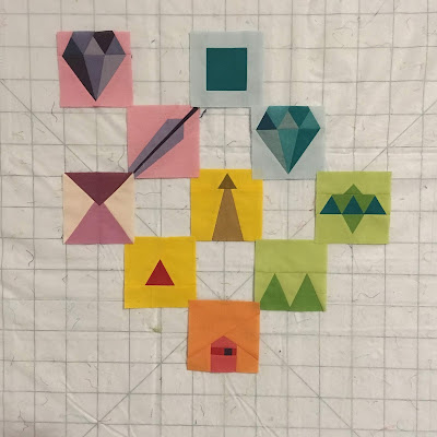
Gotta start somewhere

Random


I really liked this layout - just the blocks, no background, arranged to create the Colorwash Effect.
But that would make a tiny quilt and for all the time that went into it I wanted something a little more substantial.
Some method to the madness
So the blocks were spread out to alternate with background blocks.
Almost there and yet so far

A solid black or a solid white will make the blocks pop but may seem uninspired.
Sometimes simple is the best way to go. But is this that time?


All those folks who believe that art just comes naturally to the artist, do not know about our discards.  In quilty terms, you can see where the needle has been but you do not see where the seam ripper has been. There is a lot of trial and error before a project is finalized.

Black Center, graying out to the edges
How much gray is enough? Do I want light grey or charcoal?

Light Center, Darker at the edges

In this case, the design wall was a life-saver.
Should the background start as white in the center and get darker towards the edges...
Or black in the center and fade to almost white at the corners.

Light Grey to Black

This may be it

After several do-overs, many conflicting opinions, I chose the graduated layout with maximum contrast, meaning dark background near the lighter blocks and lighter background as the blocks got darker towards the corners.

Final Layout

Yes it took several iterations but I am sure this process was worth the final layout.

I shared the completed flimsy on Ig as required. There there were a few grand prizes.  No, I did not win anything. But I finished the top and I received the finishers pin.

Finishers Pin!!!

Paul promised me a spa gift card if I finished the quilt.

Choosing the backing was easy but choosing the quilting was not.

Bright Backing

Walking Foot Quilting

Nothing should distract from the painfully paper pieced blocks. Since I firmly refuse to do a stitch in the ditch and my several attempts at a spiral failed miserably, I chose a simple straight lines at 45 degree angle.

For binding I chose a greenish/aqua/striped fabric.  It just seemed to fit.
Aqua/Turquoise Striped Binding

Finished it!!!
And here are a few more pictures because I cannot stop showing off this jewel of a quilt.

So happy


It glows


Me (reading the news): Natalie Portman will wield Thor's hammer in the next Marvel movie
Paul (smiling naughtily): It is about time.
Me: This is not a sexual reference.
Paul: I beg to differ.
Me: You don't have to beg.  You can have anything you want!!!
Paul: You can have anything you want too.
Me: How about that spa gift card?
Paul: Sure babe!!!

This is me at the spa, after the massage and shower - in a state of pure bliss.

Ah bliss!!!


There is only one thing that can add to my bliss - your comments.  I'd love to hear from you.
I will be sharing with all my favorite linky parties.  See full list on the sidebar.